Prebrowsing
 A favorite character from the MASH TV series is Corporal Walter Eugene O’Reilly, fondly referred to as “Radar” for his knack of anticipating events before they happen. Radar was a rare example of efficiency because he was able to carry out Lt. Col. Blake’s wishes before Blake had even issued the orders.
What if the browser could do the same thing? What if it anticipated the requests the user was going to need, and could complete those requests ahead of time? If this was possible, the performance impact would be significant. Even if just the few critical resources needed were already downloaded, pages would render much faster.
Browser cache isn’t enough
You might ask, “isn’t this what the cache is for?” Yes! In many cases when you visit a website the browser avoids making costly HTTP requests and just reads the necessary resources from disk cache. But there are many situations when the cache offers no help:
- first visit – The cache only comes into play on subsequent visits to a site. The first time you visit a site it hasn’t had time to cache any resources.
- cleared – The cache gets cleared more than you think. In addition to occasional clearing by the user, the cache can also be cleared by anti-virus software and browser bugs. (19% of Chrome users have their cache cleared at least once a week due to a bug.)
- purged – Since the cache is shared by every website the user visits, it’s possible for one website’s resources to get purged from the cache to make room for another’s.
- expired – 69% of resources don’t have any caching headers or are cacheable for less than one day. If the user revisits these pages and the browser determines the resource is expired, an HTTP request is needed to check for updates. Even if the response indicates the cached resource is still valid, these network delays still make pages load more slowly, especially on mobile.
- revved – Even if the website’s resources are in the cache from a previous visit, the website might have changed and uses different resources.
Something more is needed.
Prebrowsing techniques
In their quest to make websites faster, today’s browsers offer a number of features for doing work ahead of time. These “prebrowsing” (short for “predictive browsing” – a word I made up and a domain I own) techniques include:
<link rel="dns-prefetch" ...><link rel="prefetch" ...><link rel="prerender" ...>- DNS pre-resolution
- TCP pre-connect
- prefreshing
- the preloader
These features come into play at different times while navigating web pages. I break them into these three phases:
- previous page – If a web developer has high confidence about which page you’ll go to next, they can use LINK REL dns-prefetch, prefetch or prerender on the previous page to finish some work needed for the next page.
- transition – Once you navigate away from the previous page there’s a transition period after the previous page is unloaded but before the first byte of the next page arrives. During this time the web developer doesn’t have any control, but the browser can work in anticipation of the next page by doing DNS pre-resolution and TCP pre-connects, and perhaps even prefreshing resources.
- current page – As the current page is loading, browsers have a preloader that scans the HTML for downloads that can be started before they’re needed.
Let’s look at each of the prebrowsing techniques in the context of each phase.
Phase 1 – Previous page
As with any of this anticipatory work, there’s a risk that the prediction is wrong. If the anticipatory work is expensive (e.g., steals CPU from other processes, consumes battery, or wastes bandwidth) then caution is warranted. It would seem difficult to anticipate which page users will go to next, but high confidence scenarios do exist:
- If the user has done a search with an obvious result, that result page is likely to be loaded next.
- If the user navigated to a login page, the logged-in page is probably coming next.
- If the user is reading a multi-page article or paginated set of results, the page after the current page is likely to be next.
Let’s take the example of searching for Adventure Time to illustrate how different prebrowsing techniques can be used.
DNS-PREFETCH
If the user searched for Adventure Time then it’s likely the user will click on the result for Cartoon Network, in which case we can prefetch the DNS like this:
<link rel="dns-prefetch" href="//cartoonnetwork.com">
DNS lookups are very low cost – they only send a few hundred bytes over the network – so there’s not a lot of risk. But the upside can be significant. This study from 2008 showed a median DNS lookup time of ~87 ms and a 90th percentile of ~539 ms. DNS resolutions might be faster now. You can see your own DNS lookup times by going to chrome://histograms/DNS (in Chrome) and searching for the DNS.PrefetchResolution histogram. Across 1325 samples my median is 50 ms with an average of 236 ms – ouch!
In addition to resolving the DNS lookup, some browsers may go one step further and establish a TCP connection. In summary, using dns-prefetch can save a lot of time, especially for redirects and on mobile.
PREFETCH
If we’re more confident that the user will navigate to the Adventure Time page and we know some of its critical resources, we can download those resources early using prefetch:
<link rel="prefetch" href="http://cartoonnetwork.com/utils.js">
This is great, but the spec is vague, so it’s not surprising that browser implementations behave differently. For example,
- Firefox downloads just one prefetch item at a time, while Chrome prefetches up to ten resources in parallel.
- Android browser, Firefox, and Firefox mobile start prefetch requests after window.onload, but Chrome and Opera start them immediately possibly stealing TCP connections from more important resources needed for the current page.
- An unexpected behavior is that all the browsers that support prefetch cancel the request when the user transitions to the next page. This is strange because the purpose of prefetch is to get resources for the next page, but there might often not be enough time to download the entire response. Canceling the request means the browser has to start over when the user navigates to the expected page. A possible workaround is to add the “Accept-Ranges: bytes” header so that browsers can resume the request from where it left off.
It’s best to prefetch the most important resources in the page: scripts, stylesheets, and fonts. Only prefetch resources that are cacheable – which means that you probably should avoid prefetching HTML responses.
PRERENDER
If we’re really confident the user is going to the Adventure Time page next, we can prerender the page like this:
<link rel="prerender" href="http://cartoonnetwork.com/">
This is like opening the URL in a hidden tab – all the resources are downloaded, the DOM is created, the page is laid out, the CSS is applied, the JavaScript is executed, etc. If the user navigates to the specified href, then the hidden page is swapped into view making it appear to load instantly. Google Search has had this feature for years under the name Instant Pages. Microsoft recently announced they’re going to similarly use prerender in Bing on IE11.
Many pages use JavaScript for ads, analytics, and DHTML behavior (start a slideshow, play a video) that don’t make sense when the page is hidden. Website owners can workaround this issue by using the page visibility API to only execute that JavaScript once the page is visible.
Support for dns-prefetch, prefetch, and prerender is currently pretty spotty. The following table shows the results crowdsourced from my prebrowsing tests. You can see the full results here. Just as the IE team announced upcoming support for prerender, I hope other browsers will see the value of these features and add support as well.
| dns-prefetch | prefetch | prerender | |
|---|---|---|---|
| Android 4 | 4 | ||
| Chrome | 22+ | 31+1 | 22+ |
| Chrome Mobile | 29+ | ||
| Firefox | 22+2 | 23+2 | |
| Firefox Mobile | 24+ | 24+ | |
| IE | 113 | 113 | 113 |
| Opera | 15+ |
- 1 Need to use the
--prerender=enabledcommandline option. - 2 My friend at Mozilla said these features have been present since version 12.
- 3 This is based on a Bing blog post. It has not been tested.
Ilya Grigorik‘s High Performance Networking in Google Chrome is a fantastic source of information on these techniques, including many examples of how to see them in action in Chrome.
Phase 2 – Transition
When the user clicks a link the browser requests the next page’s HTML document. At this point the browser has to wait for the first byte to arrive before it can start processing the next page. The time-to-first-byte (TTFB) is fairly long – data from the HTTP Archive in BigQuery indicate a median TTFB of 561 ms and a 90th percentile of 1615 ms.
During this “transition” phase the browser is presumably idle – twiddling its thumbs waiting for the first byte of the next page. But that’s not so! Browser developers realized that this transition time is a HUGE window of opportunity for performance prebrowsing optimizations. Once the browser starts requesting a page, it doesn’t have to wait for that page to arrive to start working. Just like Radar, the browser can anticipate what will need to be done next and can start that work ahead of time.
DNS pre-resolution & TCP pre-connect
The browser doesn’t have a lot of context to go on – all it knows is the URL being requested, but that’s enough to do DNS pre-resolution and TCP pre-connect. Browsers can reference prior browsing history to find clues about the DNS and TCP work that’ll likely be needed. For example, suppose the user is navigating to http://cartoonnetwork.com/. From previous history the browser can remember what other domains were used by resources in that page. You can see this information in Chrome at chrome://dns. My history shows the following domains were seen previously:
- ads.cartoonnetwork.com
- gdyn.cartoonnetwork.com
- i.cdn.turner.com
During this transition (while it’s waiting for the first byte of Cartoon Network’s HTML document to arrive) the browser can resolve these DNS lookups. This is a low cost exercise that has significant payoffs as we saw in the earlier dns-prefetch discussion.
If the confidence is high enough, the browser can go a step further and establish a TCP connection (or two) for each domain. This will save time when the HTML document finally arrives and requires page resources. The Subresource PreConnects column in chrome://dns indicates when this occurs. For more information about dns-presolution and tcp-preconnect see DNS Prefetching.
Prefresh
Similar to the progression from LINK REL dns-prefetch to prefetch, the browser can progress from DNS lookups to actual fetching of resources that are likely to be needed by the page. The determination of which resources to fetch is based on prior browsing history, similar to what is done in DNS pre-resolution. This is implemented as an experimental feature in Chrome called “prefresh” that can be turned on using the --speculative-resource-prefetching="enabled" flag. You can see the resources that are predicted to be needed for a given URL by going to chrome://predictors and clicking on the Resource Prefetch Predictor tab.
The resource history records which resources were downloaded in previous visits to the same URL, how often the resource was hit as well as missed, and a score for the likelihood that the resource will be needed again. Based on these scores the browser can start downloading critical resources while it’s waiting for the first byte of the HTML document to arrive. Prefreshed resources are thus immediately available when the HTML needs them without the delays to fetch, read, and preprocess them. The implementation of prefresh is still evolving and being tested, but it holds potential to be another prebrowsing timesaver that can be utilized during the transition phase.
Phase 3 – Current Page
Once the current page starts loading there’s not much opportunity to do prebrowsing – the user has already arrived at their destination. However, given that the average page takes 6+ seconds to load, there is a benefit in finding all the necessary resources as early as possible and downloading them in a prioritized order. This is the role of the preloader.
Most of today’s browsers utilize a preloader – also called a lookahead parser or speculative parser. The preloader is, in my opinion, the most important browser performance optimization ever made. One study found that the preloader alone improved page load times by ~20%. The invention of preloaders was in response to the old browser behavior where scripts were downloaded one-at-a-time in daisy chain fashion.
Starting with IE 8, parsing the HTML document was modified such that it forked when an external SCRIPT SRC tag was hit: the main parser is blocked waiting for the script to download and execute, but the lookahead parser continues parsing the HTML only looking for tags that might generate HTTP requests (IMG, SCRIPT, LINK, IFRAME, etc.). The lookahead parser queues these requests resulting in a high degree of parallelized downloads. Given that the average web page today has 17 external scripts, you can imagine what page load times would be like if they were downloaded sequentially. Being able to download scripts and other requests in parallel results in much faster pages.
The preloader has changed the logic of how and when resources are requested. These changes can be summarized by the goal of loading critical resources (scripts and stylesheets) early while loading less critical resources (images) later. This simple goal can produce some surprising results that web developers should keep in mind. For example:
- JS responsive images get queued last – I’ve seen pages that had critical (bigger) images that were loaded using a JavaScript responsive images technique, while less critical (smaller) images were loaded using a normal IMG tag. Most of the time I see these images being downloaded from the same domain. The preloader looks ahead for IMG tags, sees all the less critical images, and adds those to the download queue for that domain. Later (after DOMContentLoaded) the JavaScript responsive images technique kicks in and adds the more critical images to the download queue – behind the less critical images! This is often not the expected nor desired behavior.
- scripts “at the bottom” get loaded “at the top” – A rule I promoted starting in 2007 is to move scripts to the bottom of the page. In the days before preloaders this would ensure that all the requests higher in the page, including images, got downloaded first – a good thing when the scripts weren’t needed to render the page. But most preloaders give scripts a higher priority than images. This can result in a script at the bottom stealing a TCP connection from an image higher in the page causing above-the-fold rendering to take longer.
When it comes to the preloader the bottomline is that the preloader is a fantastic performance optimization for browsers, but the logic is new and still evolving so web developers should be aware of how the preloader works and watch their pages for any unexpected download behavior.
As the low hanging fruit of web performance optimization is harvested, we have to look harder to find the next big wins. Prebrowsing is an area that holds a lot of potential to deliver pages instantly. Web developers and browser developers have the tools at their disposal and some are taking advantage of them to create these instant experiences. I hope we’ll see even wider browser support for these prebrowsing features, as well as wider adoption by web developers.
[Here are the slides and video of my Prebrowsing talk from Velocity New York 2013.]
Domain Sharding revisited
With the adoption of SPDY and progress on HTTP 2.0, I hear some people referring to domain sharding as a performance anti-pattern. I disagree. Sharding resources across multiple domains is a major performance win for many websites. However, there is room for debate. Domain sharding isn’t appropriate for everyone. It may hurt performance if done incorrectly. And it’s utility might be short-lived. Is it worth sharding domains? Let’s take a look.
Compelling Data
The HTTP Archive has a field call “maxDomainReqs”. The explanation requires a few sentences: Websites request resources from various domains. The average website today accesses 16 different domains as shown in the chart below. That number has risen from 12.5 a year ago. That’s not surprising given the rise in third party content (ads, widgets, analytics).
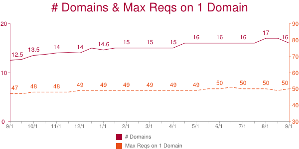
The HTTP Archive counts the number of requests made on each domain. The domain with the most requests is the “max domain” and the number of requests on that domain is the “maxDomainReqs”. The average maxDomainReqs value has risen from 47 to 50 over the past year. That’s not a huge increase, but the fact that the average number of requests on one domain is so high is startling.
50 is the average maxDomainReqs across the world’s top 300K URLs. But averages don’t tell the whole story. Using the HTTP Archive data in BigQuery and bigqueri.es, both created by Ilya Grigorik, it’s easy to find percentile values for maxDomainReqs: the 50th percentile is 39, the 90th percentile is 97, and the 95th percentile is 127 requests on a single domain.
This data shows that a majority of websites have 39 or more resources being downloaded from a single domain. Most browsers do six requests per hostname. If we evenly distribute these 39 requests across the connections, each connection must do 6+ sequential requests. Response times per request vary widely, but I use 500 ms as an optimistic estimate. If we use 500 ms as the typical responsive time, this introduces a 3000 ms long pole in the response time tent. In reality, requests are assigned to whatever connection is available, and 500 ms might not be the typical response time for your requests. But given the six-connections-per-hostname limit, 39 requests on one domain is a lot.
Wrong sharding
There are costs to domain sharding. You’ll have to modify your website to actually do the sharding. This is likely a one time cost; the infrastructure only has to be setup once. In terms of performance the biggest cost is the extra DNS lookup for each new domain. Another performance cost is the overhead of establishing each TCP connection and ramping up its congestion window size.
Despite these costs, domain sharding has great benefit for websites that need it and do it correctly. That first part is important – it doesn’t make sense to do domain sharding if your website has a low “maxDomainReqs” value. For example, if the maximum number of resources downloaded on a single domain is 6, then you shouldn’t deploy domain sharding. With only 6 requests on a single domain, most browsers are able to download all 6 in parallel. On the other hand, if you have 39 requests on a single domain, sharding is probably a good choice. So where’s the cutoff between 6 and 39? I don’t have data to answer this, but I would say 20 is a good cutoff. Other aspects of the page affect this decision. For example, if your page has a lot of other requests, then those 20 resources might not be the long pole in the tent.
The success of domain sharding can be mitigated if it’s done incorrectly. It’s important to keep these guidelines in mind.
- It’s best to shard across only two domains. You can test larger values, but previous tests show two to be the optimal choice.
- Make sure that the sharding logic is consistent for each resource. You don’t want a single resource, say main.js, to flip-flop between domain1 and domain2.
- You don’t need to setup different servers for each domain – just create CNAMEs. The browser doesn’t care about the final IP address – it only cares that the hostnames are different.
These and other issues are explained in more detail in Chapter 11 of Even Faster Web Sites.
Short term hack?
Perhaps the strongest argument against domain sharding is that it’s unnecessary in the world of SPDY (as well as HTTP 2.0). In fact, domain sharding probably hurts performance under SPDY. SPDY supports concurrent requests (send all the request headers early) as well as request prioritization. Sharding across multiple domains diminishes these benefits. SPDY is supported by Chrome, Firefox, Opera, and IE 11. If your traffic is dominated by those browsers, you might want to skip domain sharding. On the other hand, IE 6&7 are still somewhat popular and only support 2 connections per hostname, so domain sharding is an even bigger win in those browsers.
A middle ground is to alter domain sharding depending on the client: 1 domain for browsers that support SPDY, 2 domains for non-SPDY modern browsers, 3-4 domains for IE 6-7. This makes domain sharding harder to deploy. It also lowers the cache hit rate on intermediate proxies.
There’s no need for domain sharding in the world of HTTP 2.0 across all popular browsers. Until then, there’s no silver bullet answer. But if you’re one of the websites with 39+ resources on a single hostname, domain sharding is worth exploring.
Web performance for the future
I started working on web performance around 2003. My first major discovery was the Performance Golden Rule:
80-90% of the end-user response time is spent on the frontend. Start there.
Up until that point all of my web development experience had been on the backend – Apache, MySQL, Perl, Java, C & C++. When I saw how much time was being spent on the frontend, I knew my performance research had to focus there.
My first discussion about web performance was with Nate Koechley when we both worked at Yahoo!. (Now we’re both at Google!) I hadn’t met Nate before, but someone told me he was the person to talk to about clientside development. I don’t think YUI existed yet, but Nate and other future YUI team members were present, leading pockets of web development throughout the company.
God bless Nate and those other folks for helping me out. I was so ignorant. I was good at finding performance inefficiencies, but I hadn’t done much frontend development. They helped me translate those inefficiencies into best practices. The other thing was – this was still early days in terms of frontend development. In fact, when I was writing my first book I didn’t know what words to use to refer to my target reader. I asked Nate and he said “F2E – frontend engineer”.
Today it might seem funny to ask that question, but frontend engineering was a new discipline back then. This was before YUI, before Firebug, before jQuery – it was a long time ago! Back then, most companies asked their backend (Java & C) developers to take a swag at the frontend code. (Presumably you had a head start if you knew Java because JavaScript was probably pretty similar.)
Fast forward to today when most medium-to-large web companies have dedicated frontend engineers, and many have dedicated frontend engineering teams. (I just saw this at Chegg last week.) Frontend engineering has come a long way. It’s a recognized and respected discipline, acknowledged as critical by anyone with a meaningful presence on the Web.
I like to think that web performance has helped frontend engineering grow into the role that it has today. Quantifying and evangelizing how web performance is critical to creating a good user experience and improves business metrics focuses attention on the frontend. People who know the Web know that quality doesn’t stop when the bytes leave the web server. The code running in the browser has be highly optimized. To accomplish this requires skilled engineers with established best practices, and the willingness and curiosity to adapt to a constantly changing platform. Thank goodness for frontend engineers!
This reminiscing is the result of my reflecting on the state of web performance and how it needs to grow. I’ve recently written and spoken about the overall state of the Web in terms of performance. While page load times have gotten faster overall, this is primarily due to faster connection speeds and faster browsers. The performance quality of sites seems to be getting worse: pages are heavier, fewer resources are cacheable, the size of the DOM is growing, etc.
How can we improve web performance going forward?
The state of web performance today reminds me of frontend engineering back in the early days. Most companies don’t have dedicated performance engineers, let alone performance teams. Instead, the job of improving performance is tacked on to existing teams. And because web performance spans frontend, backend, ops, and QA it’s not clear which team should ride herd. I shake my head every time a new performance best practice is found. There’s so much to know already, and the body of knowledge is growing.
Asking backend developers to do frontend engineering is a mistake. Frontend engineering is an established discipline. Similarly, asking fronted|backend|ops|QA engineers to take on performance engineering is a mistake. Performance engineering is its own discipline. The problem is, not many people have realized that yet. Our performance quality degrades as we ask teams to focus on performance “just for this quarter” or for “25% of your time”. Progress is made, and then erodes when attention focuses elsewhere. Best practices are adopted, but new best practices are missed when we cycle off performance.
What’s needed are dedicated web performance engineers and dedicated performance teams. Just like frontend engineering, these teams will start small – just one person at first. But everyone will quickly see how the benefits are bigger, are reached sooner, and don’t regress. The best practices will become more widely known. And the performance quality of the Web will steadily grow.
ActiveTable bookmarklet
I write a lot of code that generates HTML tables. If the code gets a lot of use, I’ll go back later and integrate my default JavaScript library to do table sorting. (My code is based on Standardista Table Sorting by Neil Crosby.) In addition to sorting, sometimes it’s nice to be able to hide superfluous columns. For example, the HTTP Archive page for viewing a single website’s results (e.g., WholeFoods) has a table with 39 columns! I wrote some custom JavaScript to allow customizing which columns were displayed. But generally, I generate tables that aren’t sortable and have fixed columns.
It turns out, this is true for many websites. Each day I visit a few pages with a table that I wish was sortable. Sometimes there are so many columns I wish I could hide the less important ones. This is especially true if my 13″ screen is the only monitor available.
This problem finally became big enough that I wrote a bookmarklet to solve the problem: activetable.js
Here’s how to use it:
1. Add this ActiveTable bookmarklet link to your bookmarks. (Drag it to your Bookmarks toolbar, or right-click and add the link to your bookmarks.)
2. Go to a page with a big table. For example, Show Slow. Once that page is loaded, click on the ActiveTable bookmark. This loads activetable.js which makes the table sortable and customizable. The table’s header row is briefly highlighted in blue to indicate it’s active.
3. Hover over a column you want to sort or remove. The ActiveTable widget is displayed:

4. Click on the sort icon to toggle between ascending and descending. Click on the red “X” to hide the column. To UNhide all columns just alt+click on any TH element.
Another nice feature of ActiveTable is the columns you choose to hide are stored in localStorage. The next time you come to the same page and launch ActiveTable, you’re asked if you want to hide the same columns again.
CAVEATS: I’ve only tested the code on Chrome and Firefox. Tables with TD cells that span multiple rows or columns may not work as expected.
You can test it out on these real world pages:
- Voting Record For Feinstein – This table is 20 pages long and doesn’t have any way to sort.Â
- World University Rankings – This table is already sortable, but sorting the table causes the entire page to reload. ActiveTable does sorting in place, without a reload.
- Imdb All-Time USA Box office – Even though this table has 557 rows, it’s not sortable. ActiveTable allows sorting, but sorts the dollar values alphabetically.
I love having my Web my way. ActiveTable makes it more enjoyable for me to wade through the massive tables I encounter every day.
Twitter widget update
A few weeks ago I had Chrome Dev Tools open while loading my personal website and noticed the following console messages:

I have a Twitter widget in my web page. I think this notice of deprecation is interesting. I use several 3rd party widgets and have never noticed a developer-targeted warning like this. Perhaps it’s done frequently, but this was the first time I saw anything like this.
I really appreciated the heads up. The previous Twitter widget loaded a script synchronously causing bad performance. I had “asyncified” the snippet by reverse engineering the code. (See slides 11-18 from my Fluent High Performance Snippets presentation.) This was about an hour of work and resulted in ~40 lines of additional JavaScript in my page.
The new Twitter snippet is asynchronous – yay! I’m able to replace my hack with one line of markup and one line of JavaScript. All the options I want (size, color, etc.) are available. I just did the update today and am looking forward to seeing if it reduces my onload metrics.
Getting consumers to update old snippet code is a challenge for snippet owners. This is why so many sites use bootstrap scripts. The downside is bootstrap scripts typically result in two script downloads resulting in a slower snippet rendering time.
An interesting study that could be done with data from the HTTP Archive would be to analyze the adoption of new snippets. For example, tracking the migration from urchin.js to ga.js, or widgets.twimg.com/.../widget.js to platform.twitter.com/widgets.js. This would require a way to identify the before and after script. Correlating this with the techniques used to motivate website owners to change their code could help identify some best practices.
Twitter’s technique of logging warnings to console worked for me, but I don’t know how long ago they offered the async snippet version. Perhaps I’ve been lagging for months. I bet we could identify other good (and bad) techniques for evangelizing a massive code upgrade for third party widgets. That would be a good thing.
Browser Busy Indicators
I’m doing research on the perception of speed for my Ignite Velocity talk. The perception of website speed is obviously fueled by what the user sees in the browser. While the content of a website is controlled by the website owner, the browser also provides feedback to the user. This browser feedback affects user perception of website speed. Good developers need to understand how their code affects what users see, including the browser feedback that’s triggered (or not triggered).
Busy Indicators
Let’s start by enumerating the browser’s feedback mechanisms. I’ve identified six ways that browsers give feedback when they’re busy doing some action:

- tab icon – This is typically the site’s favicon. It turns to a spinner when that tab is busy.
- status bar – Some browsers display a message about outstanding requests in the status bar.
- reload icon – The reload icon (typically a circular arrow) changes to an “X” during downloads.
- progress bar – Some browsers have a progress bar. Opera shows the fraction of completed downloads:

- network busy – iOS shows a busy indicator whenever there’s network traffic. (Technically this is outside the browser but I included it since it’s a strong visual cue at the top of the screen.)
- cursor – In some situations the cursor changes to a “progress cursor”.
Test Scenarios
The browser busy indicators are triggered during normal web surfing such as clicking links. They’re also triggered by some of the dynamic behaviors popular in today’s web pages. I came up with this list of scenarios under which to measure browser busy indicators:
- click link – Click a link to another web page.
- async script – The HTML document contains
<SCRIPT ASYNC SRC="...">. - dynamic script before onload – The HTML document loads a script usingÂ
document.createElement('script') andappendChild(). - dynamic iframe – Clicking a button initiates the loading of an iframe usingÂ
document.createElement('iframe')Â andÂappendChild(). - dynamic script – Same as dynamic iframe but with a script.
- dynamic stylesheet – Same as dynamic iframe but with a stylesheet.
- dynamic image – Same as dynamic iframe but with an image.
- dynamic background image – Same as dynamic iframe but with a CSS background image.
- XHR – Clicking a button initiates an XMLHttpRequest.
- long JS loop – Clicking a button initiates some JavaScript that loops for a few seconds.
I chose these scenarios to mimic real world situations. For example, many single page web apps use XHR – do those trigger any browser busy indicators? Photo carousels often fetch images dynamically – does the user get any feedback from the browser when that happens?
You can see the specific code for each scenario on this test page. I ran each scenario across the major browsers and recorded the results in a Browserscope user test.
Results
Many of the test cases didn’t trigger any of the browser busy indicators: dynamic script, dynamic stylesheet, dynamic image, dynamic background image, XHR, and long JS loop. (Except on iOS the network spinner was triggered for every test that involved an HTTP request.) I didn’t include these tests in the results table. The results for click link, async script, dynamic script before onload, and dynamic iframe are shown in the following table.
| browser | click link | async script | dynamic script before onload |
dynamic iframe |
|---|---|---|---|---|
| Chrome 27 (Mac OS) | TSCPRN | TSCPRN | TSCPRN | TSCPRN |
| Chrome 27 (Windows) | TSCPRN | TSCPRN | TSCPRN | TSCPRN |
| Firefox 21 (Mac OS) | TSCPRN | TSCPRN | TSCPRN | TSCPRN |
| Firefox 21 (Windows) | TSCPRN | TSCPRN | TSCPRN | TSCPRN |
| IE 9 (Windows) | TSCPRN | TSCPRN | TSCPRN | TSCPRN |
| Opera 12 (Mac OS) | TSCPRN | TSCPRN | TSCPRN | TSCPRN |
| Opera 12 (Windows) | TSCPRN | TSCPRN | TSCPRN | TSCPRN |
| Safari 6 (Mac OS) | TSCPRN | TSCPRN | TSCPRN | TSCPRN |
| Safari 5 (Windows) | TSCPRN | TSCPRN | TSCPRN | TSCPRN |
| Mobile: | ||||
| Android 4 | TSCPRN | TSCPRN | TSCPRN | TSCPRN |
| Chrome Mobile 26 | TSCPRN | TSCPRN | TSCPRN | TSCPRN |
| Mobile Safari 6 | TSCPRN | TSCPRN | TSCPRN | TSCPRN |
Each result is essentially a bitmask indicating whether the busy indicator was triggered. For example, the first result for “Chrome 27 (Mac OS)” and the “click link” test is TSCPRN. This means the Tab icon, Status bar, and Reload icon indicators were triggered; but the Cursor, Progress bar, and Network indicators were not triggered. A few notes about the indicators:
- The network indicator is only applicable for Mobile Safari.
- The progress bar indicator is only applicable for Opera, Safari, Android, Chrome Mobile, and Mobile Safari.
- Mobile browsers don’t have tabs, status bars, nor cursors (currently) so those indicators aren’t applicable.
Takeaways
The purpose of these tests is to see how the browser busy indicators might affect the user’s perception of speed under different scenarios. The tests themselves are contrived, but it’s easy (and necessary) to put them in the context of a web page.
For example, if a feature involves a JSON request, which technique should be used? These browser busy indicators provide some guidance. If the JSON data is asynchronous to the user experience, such as updating stock quotes or friends’ online status, then it would be better to not trigger the browser busy indicators. Doing so would make the user pause their current actions and wonder what the web page was doing. Conversely, if the feature was synchronous to the user experience, such as opening a mail folder, then it would be better to give the user feedback that the action was being performed.
In this context we note that the dynamic iframe technique triggers busy indicators in some browsers. Therefore, this would be a bad choice for background tasks. And if it was chosen for a synchronous action it should be augmented to provide feedback across all browsers (such as a progress icon or busy spinner).
One of the biggest takeaways for me was that the progress cursor is only triggered on Windows. I find this to be a primary feedback mechanism when using the mouse – especially when clicking a link. These Mozilla bug comments seem to point to this being a Mac OS design guideline. I find it distracting on Mac OS to have to move my eye away from where I’m focusing in order to get feedback that my click was “heard”.
On the note of techniques that do not trigger busy indicators, almost all of the dynamic loading techniques fall into this category, the exception being dynamic iframe. (By “dynamic loading” I mean using JavaScript to initiate the HTTP request.)Â This is good and bad. Often dynamic images are used to beacon back metrics and logging information. It’s good to know these beacons aren’t interfering with the user experience. On the other hand, if a synchronous feature loads scripts dynamically, it might be necessary to provide other feedback to the user that the action is being carried out.
These busy indicators have an impact on the user’s perception of website speed. Triggering busy indicators for actions that are supposed to be in the background brings them to the user’s attention making the experience feel slower. If a user’s action is synchronous but there’s no feedback, that’s frustrating and makes the experience seem longer than it actually is. We can produce better user experiences by taking these tradeoffs into consideration and avoiding them or augmenting them depending on the situation.
Moving beyond window.onload()
[Originally posted in the 2012 Performance Calendar. Reposting here for folks who missed it.]
There’s an elephant in the room that we’ve been ignoring for years:
window.onload is not the best metric for measuring website speed
We haven’t actually been “ignoring†this issue. We’ve acknowledged it, but we haven’t coordinated our efforts to come up with a better replacement. Let’s do that now.
window.onload is so Web 1.0
What we’re after is a metric that captures the user’s perception of when the page is ready. Unfortunately, perception.ready() isn’t on any browser’s roadmap. So we need to find a metric that is a good proxy.
Ten years ago, window.onload was a good proxy for the user’s perception of when the page was ready. Back then, pages were mostly HTML and images. JavaScript, CSS, DHTML, and Ajax were less common, as were the delays and blocked rendering they introduce. It wasn’t perfect, but window.onload was close enough. Plus it had other desirable attributes:
- standard across browsers -Â
window.onload means the same thing across all browsers. (The only exception I’m aware of is that IE 6-9 don’t wait for async scripts before firingÂwindow.onload, while most other browsers do.) - measurable by 3rd parties –
window.onload is a page milestone that can be measured by someone other than the website owner, e.g., metrics services like Keynote Systems and tools like Boomerang. It doesn’t require website owners to add custom code to their pages. - measurable for real users – MeasuringÂ
window.onload is a lightweight operation, so it can be performed on real user traffic without harming the user experience.
Web 2.0 is more dynamic
Fast forward to today and we see that window.onload doesn’t reflect the user perception as well as it once did.
There are some cases where a website renders quickly but window.onload fires much later. In these situations the user perception of the page is fast, but window.onload says the page is slow. A good example of this is Amazon product pages. Amazon has done a great job of getting content that’s above-the-fold to render quickly, but all the below-the-fold reviews and recommendations produce a high window.onload value. Looking at these Amazon WebPagetest results we see that above-the-fold is almost completely rendered at 2.0 seconds, but window.onload doesn’t happen until 5.2 seconds. (The relative sizes of the scrollbar thumbs shows that a lot of content was added below-the-fold.)
 Amazon – 2.0 seconds (~90% rendered) |
 Amazon – 5.2 seconds (onload) |
But the opposite is also true. Heavily dynamic websites load much of the visible page after window.onload. For these websites, window.onload reports a value that is faster than the user’s perception. A good example of this kind of dynamic web app is Gmail. Looking at the WebPagetest results for Gmail we see that window.onload is 3.3 seconds, but at that point only the progress bar is visible. The above-the-fold content snaps into place at 4.8 seconds. It’s clear that in this example window.onload is not a good approximation for the user’s perception of when the page is ready.
 Gmail – 3.3 seconds (onload) |
 Gmail – 4.8 seconds (~90% rendered) |
it’s about rendering, not downloads
The examples above aren’t meant to show that Amazon is fast and Gmail is slow. Nor is it intended to say whether all the content should be loaded before window.onload vs. after. The point is that today’s websites are too dynamic to have their perceived speed reflected accurately by window.onload.
The reason is because window.onload is based on when the page’s resources are downloaded. In the old days of only text and images, the readiness of the page’s content was closely tied to its resource downloads. But with the growing reliance on JavaScript, CSS, and Ajax the perceived speed of today’s websites is better reflected by when the page’s content is rendered. The use of JavaScript and CSS is growing. As the adoption of these dynamic techniques increases, so does the gap between window.onload and the user’s perception of website speed. In other words, this problem is just going to get worse.
The conclusion is clear: the replacement for window.onload must focus on rendering.
what “it†feels like
This new performance metric should take rendering into consideration. It should be more than “first paintâ€. Instead, it should capture when the above-the-fold content is (mostly) rendered.
I’m aware of two performance metrics that exist today that are focused on rendering. Both are available in WebPagetest. Above-the-fold render time (PDF) was developed at Google. It finds the point at which the page’s content reaches its final rendering, with intelligence to adapt for animated GIFs, streaming video, rotating ads, etc. The other technique, called Speed Index and developed by Pat Meenan, gives the “average time at which visible parts of the page are displayedâ€. Both of these techniques use a series of screenshots to do their analysis and have the computational complexity that comes with image analysis.
In other words, it’s not feasible to perform these rendering metrics on real user traffic in their current form. That’s important because, in addition to incorporating rendering, this new metric must maintain the attributes mentioned previously that make window.onload so appealing: standard across browsers, measurable by 3rd parties, and measurable for real users.
Another major drawback to window.onload is that it doesn’t work for single page web apps (like Gmail). These web apps only have one window.onload, but typically have several other Ajax-based “page loads†during the user session where some or most of the page content is rewritten. It’s important that this new metric works for Ajax apps.
ball rolling
I completely understand if you’re frustrated by my lack of implementation specifics. Measuring rendering is complex. The point at which the page is (mostly) rendered is so obvious when flipping through the screenshots in WebPagetest. Writing code that measures that in a consistent, non-impacting way is really hard. My officemate pointed me to this thread from the W3C Web Performance Working Group talking about measuring first paint that highlights some of the challenges.
To make matters worse, the new metric that I’m discussing is likely much more complex than measuring first paint. I believe we need to measure when the above-the-fold content is (mostly) rendered. What exactly is “above-the-fold� What is “mostly�
Another challenge is moving the community away from window.onload. The primary performance metric in popular tools such as WebPagetest, Google Analytics Site Speed, Torbit Insight, SOASTA (LogNormal) mPulse, and my own HTTP Archive is window.onload. I’ve heard that some IT folks even have their bonuses based on the window.onload metrics reported by services like Keynote Systems and Gomez.
It’s going to take time to define, implement, and transition to a better performance metric. But we have to get the ball rolling. Relying on window.onload as the primary performance metric doesn’t necessarily produce a faster user experience. And yet making our websites faster for users is what we’re really after. We need a metric that more accurately tracks our progress toward this ultimate goal.
How fast are we going now?
[This blog post is based on my keynote at the HTML5 Developer Conference. The slides are available on SlideShare and as PPTX.]
I enjoy evangelizing web performance because I enjoy things that are fast (and efficient). Apparently, I’m not the only one. Recent ad campaigns, especially for mobile, tout the virtues of being fast. Comcast uses the words “speed”, “fastest”, “high-speed”, and “lightning-fast” in the Xfinity ads. AT&T’s humorous set of commercials talks about how “faster is better“. iPhone’s new A6 chip is touted as “twice as fast“.
Consumers, as a result of these campaigns selling speed, have higher expectations for the performance of websites they visit. Multiple case studies support the conclusion that a faster website is better received by users and has a positive impact on the business’s bottom line:
- Bing found that searches that were 2 seconds slower resulted in a 4.3% drop in revenue per user.
- When Mozilla shaved 2.2 seconds off their landing page, Firefox downloads increased 15.4%.
- Shopzilla saw conversion rates increase 7-12% as a result of their web performance optimization efforts.
- Making Barack Obama’s website 60% faster increased donation conversions 14%.
Vendors are pitching a faster web. Consumers are expecting a faster web. Businesses succeed with a faster web. But is the Web getting faster? Let’s take a look.
Connection Speed
A key to a faster web experience is a faster Internet connection, but this aspect of web performance often feels like a black box. Users and developers are at the mercy of the ISPs and carrier networks. Luckily, data from Akamai’s State of the Internet shows that connection speeds are increasing.
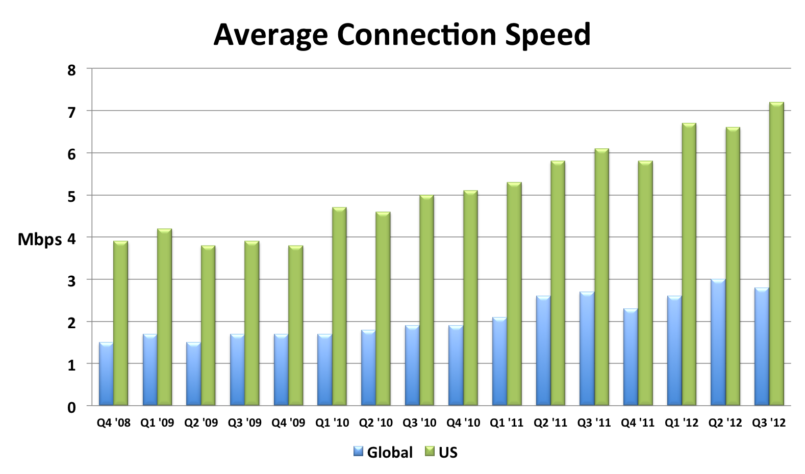
I compiled this chart by extracting the relevant data from each quarterly report. The chart shows that global connection speeds increased 4% and US connection speeds increased 18% over the most recent year that data exists (Q3 2011 to Q3 2012). I also created an Average Mobile Connection Speed chart which tracks three mobile carrier networks. Akamai masks the carrier network name but over the last year the connection speed of these mobile networks increased 30%, 68%, and 131%.
Browsers
Speed is a major feature for browsers. This focus has resulted in many performance improvements over the last few years. In my opinion browser improvements are the biggest contributor to a faster web. I’ll sidestep the contentious debate about which browser is fastest, and instead point out that, regardless of which one you choose, browsers are getting faster with each release.
The following chart shows page load times for major browsers as measured from real users. This report from Gomez is a bit dated (August 2011), but it’s the only real user data I’ve seen broken out by browser. Notice the trends for new releases – page load times improve 15-30%.

The other major benchmark for browsers is JavaScript performance. Below are charts from ZDNet’s browser benchmark report. Except for a regression in Firefox 18, all the trends are showing that browsers get faster with each release.


Page Weight
Web developers don’t have much control over connection speeds and browser optimizations, but they can control the size of their pages. Unfortunately, page weight continues to increase. The data below is from the HTTP Archive for the world’s top 1000 URLs. It shows that transfer size (number of bytes sent over the wire) increased 231K (28%) from March 2012 to March 2013. The biggest absolute increase was in images – growing 114K (23%). The biggest surprise, for me, was the growth in video by 62K (67%). This increase comes from two main factors: more sites are including video and the size of videos are increasing. Video performance is an area that we need to focus on going forward.
| Table 1. Transfer Size Year over Year | |||
| Mar 2012 | Mar 2013 | Δ | |
|---|---|---|---|
| total | 822 K | 1053 K | 231 K (28%) |
| images | 486 K | 600 K | 114 K (23%) |
| JS | 163 K | 188 K | 25 K (15%) |
| video | 92 K | 154 K | 62 K (67%) |
| HTML | 35 K | 42 K | 7 K (20%) |
| CSS | 30 K | 36 K | 6 K (20%) |
| font | 8 K | 18 K | 10 K (125%) |
| other | 8 K | 15 K | 7 K (88%) |
Quality of Craft
There are several “performance quality” metrics tracked in the HTTP Archive. Like page weight, these metrics are something that web developers have more control over. Unfortunately, these metrics were generally flat or trending down for the world’s top 1000 URLs. These metrics are hard to digest in bulk because sometimes higher is better, and other times it’s worse. There’s more detail below but the punchline is 5 of the 7 metrics got worse, and the other two were nearly flat.
| Table 2. Quality of Craft Metrics Year over Year | ||
| Mar 2012 | Mar 2013 | |
|---|---|---|
| PageSpeed Score | 82 | 84 |
| DOM Elements | 1215 | 1330 |
| # of Domains | 15 | 19 |
| Max Reqs on 1 Domain | 40 | 41 |
| Cacheable Resources | 62% | 60% |
| Compressed Responses | 76% | 77% |
| Pages w/ Redirects | 67% | 71% |
Here’s a description of each of these metrics and how they impact web performance.
- PageSpeed Score – PageSpeed is a performance “lint” analysis tool that generates a score from 0 to 100, where 100 is good. YSlow is a similar tool. Year over year the PageSpeed Score increased from 82 to 84, a (small) 2% improvement.
- DOM Elements – The number of DOM elements affects the complexity of a page and has a high correlation to page load times. The number of DOM elements increased from 1215 to 1330, meaning pages are getting more complex.
- # of Domains – The average number of domains per page increased from 15 to 19. More domains means there are more DNS lookups, which slows down the page. This is likely due to the increase in 3rd party content across the Web.
- Max Reqs on 1 Domain – The average top 1000 web page today has 100 requests spread across 19 domains. That averages out to ~5 requests per domain. But the distribution of requests across domains isn’t that even. The HTTP Archive counts how many requests are made for each domain, and then records the domain that has the maximum number of requests – that’s the “Max Reqs on 1 Domain” stat. This increased from 40 to 41. This is a bad trend for performance because most browsers only issue 6 requests in parallel, so it takes seven “rounds” to get through 41 requests. These sites would be better off adopting domain sharding.
- Cacheable Resources – Pages are faster if resources are read from cache, but that requires website owners to set the appropriate caching headers. This stat measures the percentage of requests that had a cache lifetime greater than zero. Unfortunately, the percentage of cacheable resources dropped from 62% to 60%.
- Compressed Responses – The transfer size of text responses (HTML, scripts, stylesheets, etc.) can be reduced ~70% by compressing them. It doesn’t make sense to compress binary data such as images and video. This stat shows the percentage of requests that should be compressed that actually were compressed. The number increased but just slightly from 76% to 77%.
- Pages with Redirects – Redirects slow down pages because an extra roundtrip has to be made to fetch the final response. The percentage of pages with at least one redirect increased from 67% to 71%.
These drops in performance quality metrics is especially depressing to me since evangelizing performance best practices is a large part of my work. It’s especially bad since this only looks at the top 1000 sites which typically have more resources to focus on performance.
User Experience
The ultimate goal isn’t to improve these metrics – it’s to improve the user experience. Unfortunately, we don’t have a way to measure that directly. The metric that’s used as a proxy for the user’s perception of website speed is “page load time” – the time from when the user initiates the request for the page to the time that window.onload fires. Many people, including myself, have pointed out that window.onload is becoming less representative of a web page’s perceived speed, but for now it’s the best we have.
Perhaps the largest repository of page load time data is in Google Analytics. In April 2013 the Google Analytics team published their second report on the speed of the web where they compare aggregate page load times to a year ago. The median page load time on desktops got ~3.5% faster, and on mobile was ~18%Â ~30% faster.

Scorecard
Web pages have gotten bigger. The adoption of performance best practices has been flat or trending down. Connection speeds and browsers have gotten faster. Overall, web pages are faster now than they were a year ago. I think browser vendors deserve most of the credit for this speed improvement. Going forward, web developers will continue to be pushed to add more content, especially 3rd party content, to their sites. Doing this in a way that follows performance best practices will help to make the Web even faster for next year.
I <3 image bytes
Much of my work on web performance has focused on JavaScript and CSS, starting with the early rules Move Scripts to the Bottom and Put Stylesheets at the Top from back in 2007(!). To emphasize these best practices I used to say, “JS and CSS are the most important bytes in the page”.
A few months ago I realized that wasn’t true. Images are the most important bytes in the page.
My focus on JS and CSS was largely motivated by the desire to get the images downloaded as soon as possible. Users see images. They don’t see JS and CSS. It is true that JS and CSS affect what is seen in the page, and even whether and how images are displayed (e.g., JS photo carousels, and CSS background images and media queries). But my realization was JS and CSS are the means by which we get to these images. During page load we want to get the JS and CSS out of the way as quickly as possible so that the images (and text) can be shown.
My main motivation for optimizing JS and CSS is to get rendering to happen as quickly as possible.
Rendering starts very late
With this focus on rendering in mind, I went to the HTTP Archive to see how quickly we’re getting pages to render. The HTTP Archive runs on top of WebPagetest which reports the following time measurements:
- time-to-first-byte (TTFB) – When the first packet of the HTML document arrives.
- start render – When the page starts rendering.
- onload – When window.onload fires.
I extracted the 50th and 90th percentile values for these measurements across the world’s top 300K URLs. As shown, nothing is rendered for the first third of page load time!
| Table 1. Time milestones during page load | |||
| TTFB | start render | onload | |
|---|---|---|---|
| 50th percentile | 610 ms | 2227 ms | 6229 ms |
| 90th percentile | 1780 ms | 5112 ms | 15969 ms |
Preloading
The fact that rendering doesn’t start until the page is 1/3 into the overall page load time is eye-opening. Looking at both the 50th and 90th percentile stats from the HTTP Archive, rendering starts ~32-36% into the page load time. It takes ~10% of the overall page load time to get the first byte. Thus, for ~22-26% of the page load time the browser has bytes to process but nothing is drawn on the screen. During this time the browser is typically downloading and parsing scripts and stylesheets – both of which block rendering on the page.
It used to be that the browser was largely idle during this early loading phase (after TTFB and before start render). That’s because when an older browser started downloading a script, all other downloads were blocked. This is still visible in IE 6&7. Browser vendors realized that while it’s true that constructing the DOM has to wait for a script to download and execute, there’s no reason other resources deeper in the page couldn’t be fetched in parallel. Starting with IE 8 in 2009, browsers started looking past the currently downloading script for other resources (i.e, SCRIPT, IMG, LINK, and IFRAME tags) and preloading those requests in parallel. One study showed preloading makes pages load ~20% faster. Today, all major browsers support preloading. In these Browserscope results I show the earliest version of each major browser where preloading was first supported.
(As an aside, I think preloading is the single biggest performance improvement browsers have ever made. Imagine today, with the abundance of scripts on web pages, what performance would be like if each script was downloaded sequentially and blocked all other downloads.)
Preloading and responsive images
This ties back to this tweet from Jason Grigsby:
I’ll be honest. I’m tired of pushing for resp images and increasingly inclined to encourage devs to use JS to simply break pre-loaders.
The “resp images” Jason refers to are techniques by which image requests are generated by JavaScript. This is generally used to adapt the size of images for different screen sizes. One example is Picturefill. When you combine “pre-loaders” and “resp images” an issue arises – the preloader looks ahead for IMG tags and fetches their SRC, but responsive image techniques typically don’t have a SRC, or have a stub image such as a 1×1 transparent pixel. This defeats the benefits of preloading for images. So there’s a tradeoff:
- Don’t use responsive images so that the preloader can start downloading images sooner, but the images might be larger than needed for the current device and thus take longer to download (and cost more for limited cellular data plans).
- Use responsive images which doesn’t take advantage of preloading which means the images are loaded later after the required JS is downloaded and executed, and the IMG DOM elements have been created.
As Jason says in a follow-up tweet:
The thing that drives me nuts is that almost none of it has been tested. Lots of gospel, not a lot of data.
I don’t have any data comparing the two tradeoffs, but the HTTP Archive data showing that rendering doesn’t start until 1/3 into page load is telling. It’s likely that rendering is being blocked by scripts, which means the IMG DOM elements haven’t been created yet. So at some point after the 1/3 mark the IMG tags are parsed and at some point after that the responsive image JS executes and starts downloading the necessary images.
In my opinion, this is too late in the page load process to initiate the image requests, and will likely cause the web page to render later than it would if the preloader was used to download images. Again, I don’t have data comparing the two techniques. Also, I’m not sure how the preloader works with the responsive image techniques done via markup. (Jason has a blog post that touches on that, The real conflict behind <picture> and @srcset.)
Ideally we’d have a responsive image solution in markup that would work with preloaders. Until then, I’m nervous about recommending to the dev community at large to move toward responsive images at the expense of defeating preloading. I expect browsers will add more benefits to preloading, and I’d like websites to be able to take advantage of those benefits both now and in the future.
HTML5 VIDEO bytes on iOS
HTML5 provides the VIDEO element. It includes the PRELOAD attribute that takes various values such as “none”, “metadata”, and “auto”. Mobile devices ignore all values of PRELOAD in order to avoid high data plan costs, and instead only download the video when the user initiates playback. This is explained in the Safari Developer Library:
In Safari on iOS (for all devices, including iPad), where the user may be on a cellular network and be charged per data unit, preload and autoplay are disabled. No data is loaded until the user initiates it.
However, my testing shows that iOS downloads up to 298K of video data, resulting in unexpected costs to users.
Contradiction?
In my previous post, HTML5 Video Preload, I analyzed how much data is buffered for various values of the VIDEO tag’s PRELOAD attribute. For example, specifying preload='none' ensures no video is preloaded, whereas preload='auto' results in 25 or more seconds of buffered video on desktop browsers depending on the size of the video.
The results for mobile browsers are different. Mobile browsers don’t preload any video data, no matter what PRELOAD value is specified. These preload results are based on measuring the VIDEO element’s buffered property. Using that API shows that zero bytes of data is buffered on all mobile devices including the iPhone. (Look for “Mobile Safari 6” as well as a dozen other mobile devices in the detailed results.)
While it’s true that Mobile Safari on iOS doesn’t buffer any video data as a result of the PRELOAD attribute, it does make other video requests that aren’t counted as “buffered” video. The number and size of the requests and responses depends on the video. For larger videos the total amount of data for these behind-the-scenes requests can be significant.
Unseen VIDEO Requests
[This section contains the technical details of how I found these video requests. Go to Confirming Results, More Observations if you want to skip over these details.]
While testing VIDEO PRELOAD on my iPhone, I noticed that even though the amount of buffered data was “0”, there were still multiple video requests hitting my server. Here are the video requests I see in my Apache access log when I load the test page with preload=’none’ (4M video)Â on my iPhone (iPhone4 iOS6 running standard mobile Safari):
[16/Apr/2013:15:03:48 -0700] "GET /tests/trailer.mp4?t=1366149827 HTTP/1.1" 206 319 "-" "AppleCoreMedia/1.0.0.10B146 (iPhone; U; CPU OS 6_1_2 like Mac OS X; en_us)"
[16/Apr/2013:15:03:48 -0700] "GET /tests/trailer.mp4?t=1366149827 HTTP/1.1" 206 70080 "-" "AppleCoreMedia/1.0.0.10B146 (iPhone; U; CPU OS 6_1_2 like Mac OS X; en_us)"
[16/Apr/2013:15:03:48 -0700] "GET /tests/trailer.mp4?t=1366149827 HTTP/1.1" 206 47330 "-" "AppleCoreMedia/1.0.0.10B146 (iPhone; U; CPU OS 6_1_2 like Mac OS X; en_us)"
There are three requests. They all return a “206 Partial Content” status code. The sizes of the responses shown in the access log are 319 bytes, 70,080 bytes, and 47,330 bytes respectively.
It’s possible that the server sends bytes but the client (my iPhone) doesn’t receive every packet. Since these video requests aren’t reflected using the VIDEO element’s API, I measure the actual bytes sent over the wire using tcpdump and a wifi hotspot. (See the setup details here.) This generates a pcap file that I named mediaevents-iphone.pcap. The first step is to find the connections used to make the video requests using:
tcpdump -qns 0 -A -r mediaevents-iphone.pcap
The output shows the HTTP headers and response data for every request. Let’s find the three video requests.
video request #1
Here’s the excerpt relevant for the first video request (with some binary data removed):
15:03:48.162970 IP 192.168.2.2.49186 > 69.163.242.68.80: tcp 327
GET /tests/trailer.mp4?t=1366149827 HTTP/1.1
Host: stevesouders.com
Range: bytes=0-1
X-Playback-Session-Id: E4C46EAC-17EC-491E-81F7-4EBF4B7BE12B
Accept-Encoding: identity
Accept: */*
Accept-Language: en-us
Connection: keep-alive
User-Agent: AppleCoreMedia/1.0.0.10B146 (iPhone; U; CPU OS 6_1_2 like Mac OS X; en_us)

15:03:48.183732 IP 69.163.242.68.80 > 192.168.2.2.49186: tcp 0
15:03:48.186327 IP 69.163.242.68.80 > 192.168.2.2.49186: tcp 319
HTTP/1.1 206 Partial Content
Date: Tue, 16 Apr 2013 22:03:48 GMT
Server: Apache
Last-Modified: Thu, 13 May 2010 17:49:03 GMT
ETag: "42b795-4867d5fcac1c0"
Accept-Ranges: bytes
Content-Length: 2
Content-Range: bytes 0-1/4372373
Keep-Alive: timeout=2, max=100
Connection: Keep-Alive
Content-Type: video/mp4
I highlighted some important information. This first request for trailer.mp4 occurs on connection #49186. The iPhone only requests bytes 0-1, and the server returns only those two bytes. The Content-Range response header also indicates the total size of the video: 4,372,373 bytes (~4.2M).
video request #2
Here’s the excerpt relevant for the second video request:
15:03:48.325209 IP 192.168.2.2.49186 > 69.163.242.68.80: tcp 333
GET /tests/trailer.mp4?t=1366149827 HTTP/1.1
Host: stevesouders.com
Range: bytes=0-4372372
X-Playback-Session-Id: E4C46EAC-17EC-491E-81F7-4EBF4B7BE12B
Accept-Encoding: identity
Accept: */*
Accept-Language: en-us
Connection: keep-alive
User-Agent: AppleCoreMedia/1.0.0.10B146 (iPhone; U; CPU OS 6_1_2 like Mac OS X; en_us)

15:03:48.349254 IP 69.163.242.68.80 > 192.168.2.2.49186: tcp 1460
HTTP/1.1 206 Partial Content
Date: Tue, 16 Apr 2013 22:03:48 GMT
Server: Apache
Last-Modified: Thu, 13 May 2010 17:49:03 GMT
ETag: "42b795-4867d5fcac1c0"
Accept-Ranges: bytes
Content-Length: 4372373
Content-Range: bytes 0-4372372/4372373
Keep-Alive: timeout=2, max=99
Connection: Keep-Alive
Content-Type: video/mp4
This request also uses connection #49186. The iPhone requests bytes 0-4372372 (the entire video). The Content-Length header implies that 4,372,373 bytes are returned but we’ll soon see it’s much less than that.
video request #3
Here’s the excerpt relevant for the third video request:
15:03:48.409745 IP 192.168.2.2.49187 > 69.163.242.68.80: tcp 339
GET /tests/trailer.mp4?t=1366149827 HTTP/1.1
Host: stevesouders.com
Range: bytes=4325376-4372372
X-Playback-Session-Id: E4C46EAC-17EC-491E-81F7-4EBF4B7BE12B
Accept-Encoding: identity
Accept: */*
Accept-Language: en-us
Connection: keep-alive
User-Agent: AppleCoreMedia/1.0.0.10B146 (iPhone; U; CPU OS 6_1_2 like Mac OS X; en_us)

15:03:48.435684 IP 69.163.242.68.80 > 192.168.2.2.49187: tcp 0
15:03:48.438211 IP 69.163.242.68.80 > 192.168.2.2.49187: tcp 1460
HTTP/1.1 206 Partial Content
Date: Tue, 16 Apr 2013 22:03:48 GMT
Server: Apache
Last-Modified: Thu, 13 May 2010 17:49:03 GMT
ETag: "42b795-4867d5fcac1c0"
Accept-Ranges: bytes
Content-Length: 46997
Content-Range: bytes 4325376-4372372/4372373
Keep-Alive: timeout=2, max=100
Connection: Keep-Alive
Content-Type: video/mp4
The third request is issued on a new connection: #49187. The iPhone requests the last 46,997 bytes of the video. This is likely the video’s metadata (or “moov atom”).
total packet size
I noted the connection #s because in my next step I use those to view the video file packets using this command:
tcpdump -r mediaevents-iphone.pcap | grep -E "(49186|49187)"
Here’s the output. It’s long.
15:03:48.147958 IP 192.168.2.2.49186 > apache2-pat.esp.dreamhost.com.http: Flags [.], ack 1, win 16384, length 0
15:03:48.162970 IP 192.168.2.2.49186 > apache2-pat.esp.dreamhost.com.http: Flags [P.], seq 1:328, ack 1, win 16384, length 327
15:03:48.183732 IP apache2-pat.esp.dreamhost.com.http > 192.168.2.2.49186: Flags [.], ack 328, win 14, length 0
15:03:48.186327 IP apache2-pat.esp.dreamhost.com.http > 192.168.2.2.49186: Flags [P.], seq 1:320, ack 328, win 14, length 319
15:03:48.190322 IP 192.168.2.2.49186 > apache2-pat.esp.dreamhost.com.http: Flags [.], ack 320, win 16364, length 0
15:03:48.325209 IP 192.168.2.2.49186 > apache2-pat.esp.dreamhost.com.http: Flags [P.], seq 328:661, ack 320, win 16384, length 333
15:03:48.349254 IP apache2-pat.esp.dreamhost.com.http > 192.168.2.2.49186: Flags [.], seq 320:1780, ack 661, win 16, length 1460
15:03:48.349480 IP apache2-pat.esp.dreamhost.com.http > 192.168.2.2.49186: Flags [.], seq 1780:3240, ack 661, win 16, length 1460
15:03:48.349520 IP apache2-pat.esp.dreamhost.com.http > 192.168.2.2.49186: Flags [.], seq 3240:4700, ack 661, win 16, length 1460
15:03:48.350034 IP apache2-pat.esp.dreamhost.com.http > 192.168.2.2.49186: Flags [.], seq 4700:6160, ack 661, win 16, length 1460
15:03:48.355531 IP 192.168.2.2.49186 > apache2-pat.esp.dreamhost.com.http: Flags [.], ack 3240, win 16292, length 0
15:03:48.355699 IP 192.168.2.2.49186 > apache2-pat.esp.dreamhost.com.http: Flags [.], ack 6160, win 16110, length 0
15:03:48.366281 IP 192.168.2.2.49186 > apache2-pat.esp.dreamhost.com.http: Flags [F.], seq 661, ack 6160, win 16384, length 0
15:03:48.378012 IP apache2-pat.esp.dreamhost.com.http > 192.168.2.2.49186: Flags [.], seq 6160:7620, ack 661, win 16, length 1460
15:03:48.378086 IP apache2-pat.esp.dreamhost.com.http > 192.168.2.2.49186: Flags [.], seq 7620:9080, ack 661, win 16, length 1460
15:03:48.378320 IP 192.168.2.2.49187 > apache2-pat.esp.dreamhost.com.http: Flags [S], seq 3267277275, win 65535, options [mss 1460,nop,wscale 4,nop,nop,TS val 129308742 ecr 0,sack\
OK,eol], length 0
15:03:48.378417 IP apache2-pat.esp.dreamhost.com.http > 192.168.2.2.49186: Flags [.], seq 9080:10540, ack 661, win 16, length 1460
15:03:48.378675 IP apache2-pat.esp.dreamhost.com.http > 192.168.2.2.49186: Flags [.], seq 10540:12000, ack 661, win 16, length 1460
15:03:48.379705 IP apache2-pat.esp.dreamhost.com.http > 192.168.2.2.49186: Flags [.], seq 12000:13460, ack 661, win 16, length 1460
15:03:48.379760 IP apache2-pat.esp.dreamhost.com.http > 192.168.2.2.49186: Flags [.], seq 13460:14920, ack 661, win 16, length 1460
15:03:48.383237 IP 192.168.2.2.49186 > apache2-pat.esp.dreamhost.com.http: Flags [R], seq 3028115607, win 0, length 0
15:03:48.383430 IP 192.168.2.2.49186 > apache2-pat.esp.dreamhost.com.http: Flags [R], seq 3028115607, win 0, length 0
15:03:48.383761 IP 192.168.2.2.49186 > apache2-pat.esp.dreamhost.com.http: Flags [R], seq 3028115607, win 0, length 0
15:03:48.384064 IP 192.168.2.2.49186 > apache2-pat.esp.dreamhost.com.http: Flags [R], seq 3028115607, win 0, length 0
15:03:48.384297 IP 192.168.2.2.49186 > apache2-pat.esp.dreamhost.com.http: Flags [R], seq 3028115607, win 0, length 0
15:03:48.385553 IP 192.168.2.2.49186 > apache2-pat.esp.dreamhost.com.http: Flags [R], seq 3028115607, win 0, length 0
15:03:48.399069 IP apache2-pat.esp.dreamhost.com.http > 192.168.2.2.49187: Flags [S.], seq 277046834, ack 3267277276, win 5840, options [mss 1460,nop,nop,sackOK,nop,wscale 9], len\
gth 0
15:03:48.401299 IP 192.168.2.2.49187 > apache2-pat.esp.dreamhost.com.http: Flags [.], ack 1, win 16384, length 0
15:03:48.409745 IP 192.168.2.2.49187 > apache2-pat.esp.dreamhost.com.http: Flags [P.], seq 1:340, ack 1, win 16384, length 339
15:03:48.435684 IP apache2-pat.esp.dreamhost.com.http > 192.168.2.2.49187: Flags [.], ack 340, win 14, length 0
15:03:48.438211 IP apache2-pat.esp.dreamhost.com.http > 192.168.2.2.49187: Flags [.], seq 1:1461, ack 340, win 14, length 1460
15:03:48.438251 IP apache2-pat.esp.dreamhost.com.http > 192.168.2.2.49187: Flags [.], seq 1461:2921, ack 340, win 14, length 1460
15:03:48.438671 IP apache2-pat.esp.dreamhost.com.http > 192.168.2.2.49187: Flags [.], seq 2921:4381, ack 340, win 14, length 1460
15:03:48.444261 IP 192.168.2.2.49187 > apache2-pat.esp.dreamhost.com.http: Flags [.], ack 2921, win 16201, length 0
15:03:48.446763 IP 192.168.2.2.49187 > apache2-pat.esp.dreamhost.com.http: Flags [.], ack 4381, win 16384, length 0
15:03:48.464208 IP apache2-pat.esp.dreamhost.com.http > 192.168.2.2.49187: Flags [.], seq 4381:5841, ack 340, win 14, length 1460
15:03:48.464589 IP apache2-pat.esp.dreamhost.com.http > 192.168.2.2.49187: Flags [.], seq 5841:7301, ack 340, win 14, length 1460
15:03:48.465088 IP apache2-pat.esp.dreamhost.com.http > 192.168.2.2.49187: Flags [.], seq 7301:8761, ack 340, win 14, length 1460
15:03:48.469165 IP apache2-pat.esp.dreamhost.com.http > 192.168.2.2.49187: Flags [.], seq 8761:10221, ack 340, win 14, length 1460
15:03:48.469269 IP apache2-pat.esp.dreamhost.com.http > 192.168.2.2.49187: Flags [.], seq 10221:11681, ack 340, win 14, length 1460
15:03:48.474194 IP 192.168.2.2.49187 > apache2-pat.esp.dreamhost.com.http: Flags [.], ack 7301, win 16201, length 0
15:03:48.474491 IP 192.168.2.2.49187 > apache2-pat.esp.dreamhost.com.http: Flags [.], ack 10221, win 16019, length 0
15:03:48.481544 IP 192.168.2.2.49187 > apache2-pat.esp.dreamhost.com.http: Flags [.], ack 11681, win 16384, length 0
15:03:48.495319 IP apache2-pat.esp.dreamhost.com.http > 192.168.2.2.49187: Flags [.], seq 11681:13141, ack 340, win 14, length 1460
15:03:48.495878 IP apache2-pat.esp.dreamhost.com.http > 192.168.2.2.49187: Flags [.], seq 13141:14601, ack 340, win 14, length 1460
15:03:48.495928 IP apache2-pat.esp.dreamhost.com.http > 192.168.2.2.49187: Flags [.], seq 14601:16061, ack 340, win 14, length 1460
15:03:48.500477 IP apache2-pat.esp.dreamhost.com.http > 192.168.2.2.49187: Flags [.], seq 16061:17521, ack 340, win 14, length 1460
15:03:48.500542 IP apache2-pat.esp.dreamhost.com.http > 192.168.2.2.49187: Flags [.], seq 17521:18981, ack 340, win 14, length 1460
15:03:48.500743 IP apache2-pat.esp.dreamhost.com.http > 192.168.2.2.49187: Flags [.], seq 18981:20441, ack 340, win 14, length 1460
15:03:48.503543 IP 192.168.2.2.49187 > apache2-pat.esp.dreamhost.com.http: Flags [.], ack 14601, win 16201, length 0
15:03:48.504110 IP 192.168.2.2.49187 > apache2-pat.esp.dreamhost.com.http: Flags [.], ack 17521, win 16019, length 0
15:03:48.508600 IP 192.168.2.2.49187 > apache2-pat.esp.dreamhost.com.http: Flags [.], ack 20441, win 16201, length 0
15:03:48.524397 IP apache2-pat.esp.dreamhost.com.http > 192.168.2.2.49187: Flags [.], seq 20441:21901, ack 340, win 14, length 1460
15:03:48.524753 IP apache2-pat.esp.dreamhost.com.http > 192.168.2.2.49187: Flags [.], seq 21901:23361, ack 340, win 14, length 1460
15:03:48.524773 IP apache2-pat.esp.dreamhost.com.http > 192.168.2.2.49187: Flags [.], seq 23361:24821, ack 340, win 14, length 1460
15:03:48.525207 IP apache2-pat.esp.dreamhost.com.http > 192.168.2.2.49187: Flags [.], seq 24821:26281, ack 340, win 14, length 1460
15:03:48.525756 IP apache2-pat.esp.dreamhost.com.http > 192.168.2.2.49187: Flags [.], seq 26281:27741, ack 340, win 14, length 1460
15:03:48.533224 IP 192.168.2.2.49187 > apache2-pat.esp.dreamhost.com.http: Flags [.], ack 23361, win 16201, length 0
15:03:48.533395 IP 192.168.2.2.49187 > apache2-pat.esp.dreamhost.com.http: Flags [.], ack 26281, win 16019, length 0
15:03:48.533553 IP 192.168.2.2.49187 > apache2-pat.esp.dreamhost.com.http: Flags [.], ack 27741, win 16384, length 0
15:03:48.533714 IP apache2-pat.esp.dreamhost.com.http > 192.168.2.2.49187: Flags [.], seq 27741:29201, ack 340, win 14, length 1460
15:03:48.534656 IP apache2-pat.esp.dreamhost.com.http > 192.168.2.2.49187: Flags [.], seq 29201:30661, ack 340, win 14, length 1460
15:03:48.534753 IP apache2-pat.esp.dreamhost.com.http > 192.168.2.2.49187: Flags [.], seq 30661:32121, ack 340, win 14, length 1460
15:03:48.534835 IP apache2-pat.esp.dreamhost.com.http > 192.168.2.2.49187: Flags [.], seq 32121:33581, ack 340, win 14, length 1460
15:03:48.535268 IP apache2-pat.esp.dreamhost.com.http > 192.168.2.2.49187: Flags [.], seq 33581:35041, ack 340, win 14, length 1460
15:03:48.535933 IP apache2-pat.esp.dreamhost.com.http > 192.168.2.2.49187: Flags [.], seq 35041:36501, ack 340, win 14, length 1460
15:03:48.540701 IP 192.168.2.2.49187 > apache2-pat.esp.dreamhost.com.http: Flags [.], ack 30661, win 16292, length 0
15:03:48.540792 IP 192.168.2.2.49187 > apache2-pat.esp.dreamhost.com.http: Flags [.], ack 33581, win 16110, length 0
15:03:48.540966 IP 192.168.2.2.49187 > apache2-pat.esp.dreamhost.com.http: Flags [.], ack 36501, win 15927, length 0
15:03:48.555942 IP apache2-pat.esp.dreamhost.com.http > 192.168.2.2.49187: Flags [.], seq 36501:37961, ack 340, win 14, length 1460
15:03:48.556276 IP apache2-pat.esp.dreamhost.com.http > 192.168.2.2.49187: Flags [.], seq 37961:39421, ack 340, win 14, length 1460
15:03:48.556767 IP apache2-pat.esp.dreamhost.com.http > 192.168.2.2.49187: Flags [.], seq 39421:40881, ack 340, win 14, length 1460
15:03:48.556810 IP apache2-pat.esp.dreamhost.com.http > 192.168.2.2.49187: Flags [.], seq 40881:42341, ack 340, win 14, length 1460
15:03:48.557342 IP apache2-pat.esp.dreamhost.com.http > 192.168.2.2.49187: Flags [.], seq 42341:43801, ack 340, win 14, length 1460
15:03:48.557818 IP apache2-pat.esp.dreamhost.com.http > 192.168.2.2.49187: Flags [.], seq 43801:45261, ack 340, win 14, length 1460
15:03:48.565012 IP 192.168.2.2.49187 > apache2-pat.esp.dreamhost.com.http: Flags [.], ack 39421, win 16201, length 0
15:03:48.565188 IP 192.168.2.2.49187 > apache2-pat.esp.dreamhost.com.http: Flags [.], ack 42341, win 16019, length 0
15:03:48.565232 IP 192.168.2.2.49187 > apache2-pat.esp.dreamhost.com.http: Flags [.], ack 45261, win 15836, length 0
15:03:48.565417 IP apache2-pat.esp.dreamhost.com.http > 192.168.2.2.49187: Flags [.], seq 45261:46721, ack 340, win 14, length 1460
15:03:48.565477 IP apache2-pat.esp.dreamhost.com.http > 192.168.2.2.49187: Flags [P.], seq 46721:47331, ack 340, win 14, length 610
15:03:48.571326 IP 192.168.2.2.49187 > apache2-pat.esp.dreamhost.com.http: Flags [.], ack 46721, win 16384, length 0
15:03:48.571664 IP 192.168.2.2.49187 > apache2-pat.esp.dreamhost.com.http: Flags [.], ack 47331, win 16345, length 0
15:03:50.444574 IP apache2-pat.esp.dreamhost.com.http > 192.168.2.2.49187: Flags [F.], seq 47331, ack 340, win 14, length 0
15:03:50.471892 IP 192.168.2.2.49187 > apache2-pat.esp.dreamhost.com.http: Flags [.], ack 47332, win 16384, length 0
There’s a lot of interesting things to see in there, but staying on task let’s figure out how much video data was actually received by the iPhone. We’ll look at packets sent from the server (dreamhost.com) to my iPhone (192.168.2.2) and add up the length values. The total comes to 62,249 bytes (~61K). Separating it by request comes to 319 bytes for the first response, 14,600 bytes for the second response, and 47,330 bytes for the third response. Let’s compare this true byte size to what we saw in the Apache access logs and what was in the Content-Length response headers:
| Apache access log | Content-Length | actual bytes received | |
|---|---|---|---|
| request #1 | 319 bytes | 2 bytes | 319 bytes |
| request #2 | 70,080 bytes | 4,372,373Â bytes | 14,600 bytes |
| request #3 | 47,330 bytes | 46,997 bytes | 47,330 bytes |
What this tells us is you can’t always trust what is shown in the server access logs and even the Content-Length headers. The sizes of requests 1 and 3 are consistent when you take into account that the size of headers is not included in the Content-Length. Request #2’s sizes are all over the place. Looking at the packets in more detail reveals why: the iPhone tried to close the connection after receiving 5,840 bytes and then finally reset the connection after 14,600 bytes. Thus, the actual amount of data downloaded was different than what the access log and Content-Length indicated.
The point is, some days you have to drop down into tcpdump and pcap files to get the truth. For this ~4M video looking at the pcap files shows that iOS downloaded ~61K of video data. (Thanks to Arvind Jain for helping me decipher the pcap files!)
Confirming Results, More Observations
Here are some additional observations from my testing.
Larger videos => more data: The amount of data the iPhone downloads increases for larger videos. The preload=’none’ test page for the 62M video generates seven video requests. Using the same tcpdump technique shows this larger video resulted in 304,918 bytes (~298K) of video data being downloaded.
Data not “re-used”: To make matters worse, this video data that is downloaded behind-the-scenes doesn’t reduce the download size when the user initiates playback. To test this I started a new tcpdump capture and started playing the 4.2M video. This resulted in downloading 4,401,911 bytes (~4.2M) – the size of the entire video.
Happens on cell networks: All of the tests so far were done over wifi, but data plan costs only occur over mobile networks. One possibility is that the iPhone downloads this video data on wifi, but not over carrier networks. Unfortunately, that’s not the case. I tested this by turning off wifi on my iPhone, closing all apps, resetting my cellular usage statistics, and loading the test pages five times.
For the test page with preload=’none’ (4M video) the amount of Received cellular data is 354K for all five page loads, or ~71K per page. The test page without the VIDEO tag is ~8K, so this closely matches the earlier findings that ~61K of video data is being downloaded in the background. For the preload=’none’ test page for the 62M video the amount of Received cellular data is 1.6M for five page loads, or ~320K per page. After accounting for the size of the test page and rounding errors this is close to the ~298K of video data that was found for this larger file. The conclusion is that these unseen video requests occur when the iPhone is on a cellular network as well as on wifi.
Only happens on iOS: These extraneous video requests don’t happen on my Samsung Galaxy Nexus (Android 4.2.2) using the default Android Browser as well as Chrome for Android 26. Because the tests are so hands-on I can’t test other phones jammers using Browserscope. However, knowing that a dozen or so different mobile devices ran the test on my server I searched through my access logs from the point where I published the HTML5 Video Preload blog post to see if any of them generated requests for trailer.mp4. The only ones that showed up were iPhone and iPad, suggesting that none of the other mobile devices generate these background video requests.
Strange User-Agents, no Referer: The User-Agent request header for mobile Safari on my iPhone is:
Mozilla/5.0 (iPhone; CPU iPhone OS 6_1_2 like Mac OS X) AppleWebKit/536.26 (KHTML, like Gecko) Version/6.0 Mobile/10B146 Safari/8536.25
But the User-Agent for the video requests is:
AppleCoreMedia/1.0.0.10B146 (iPhone; U; CPU OS 6_1_2 like Mac OS X; en_us)
They’re different!
My Galaxy Nexus has similar behavior. The User-Agent for Android browser is:
Mozilla/5.0 (Linux; U; Android 4.2.2; en-us; Galaxy Nexus Build/JDQ39) AppleWebKit/534.30 (KHTML, like Gecko) Version/4.0 Mobile Safari/534.30
Chrome for Android is:
Mozilla/5.0 (Linux; Android 4.2.2; Galaxy Nexus Build/JDQ39) AppleWebKit/537.31 (KHTML, like Gecko) Chrome/26.0.1410.58 Mobile Safari/537.31
But both send this User-Agent when requesting video:
stagefright/1.2 (Linux;Android 4.2.2)
It’s good to keep this in mind when investigating video requests on mobile. Another hassle is that all three of these mobile browsers omit the Referer request header. This seems like a clear oversight that makes it hard to correlate video playback with page views.
No Good Workaround
I mentioned this blog post to my officemate and he pointed out Jim Wilson’s comments in his post on Breaking the 1000ms Time to Glass Mobile Barrier. It appears Jim also saw this unseen video requests issue. He went further to find a way to avoid bandwidth contention:
We found that if the <video> tag had any information at all, the mobile device would try to oblige it. What we wanted was for something to start happening right away (e.g. showing the poster) but if we gave the video tag something to chew on it would slow down the device. From the user’s perspective nothing was happening.
So our latest version inlines critical styles into the head, uses a <div> with background:url() for the poster, has an empty <video> tag, dynamically loads Video.js, and when it’s done (onready/onload) sets the source through the Video.js api.
I added the emphasis to highlight his solution. The VIDEO tag’s markup doesn’t specify the SRC attribute. This avoids any behind-the-scenes video requests on iOS that contend for bandwidth with resources that are visible in the page (such as the POSTER image). The SRC is set later via JavaScript.
While this technique avoids the issue of bandwidth contention, it doesn’t avoid the extra video requests. When the SRC is set later it results in video data being downloaded. In fact, when I tested this technique it actually resulted in more video data being downloaded leading to even higher data costs.
It’s possible that moving the metadata to the front of the video file may reduce the amount of data downloaded. The 19M video from Video.js is formatted this way and downloads less video data than my 4M test video. Arranging the MP4 data more efficiently should be further investigated to see if it can reduce the amount of data downloaded.
Conclusion
When the HTML5 VIDEO tag is used, iOS downloads video data without the user initiating playback. In the tests described here the amount of video data downloaded ranged from 61K to 298K. This behavior differs from other mobile devices. This means simply visiting a page that uses the VIDEO element on an iPhone or iPad could result in unexpected cellular network data charges. Unfortunately, there’s no good workaround to avoid these extra video requests. I’ve submitted a bug to Apple asking that iOS avoid these extra data costs similar to other mobile devices.