Silk, iPad, Galaxy comparison
In my previous blog post I announced Loadtimer – a mobile test harness for measuring page load times. I was motivated to create Loadtimer because recent reviews of the Kindle Fire lacked the quantified data and reliable test procedures needed to compare browser performance.
Most performance evaluations of Silk that have come out since its launch have two conclusions:
- Silk is faster when acceleration is turned off.
- Silk is slow compared to other tablets.
Let’s poke at those more rigorously using Loadtimer.
Test Description
In this test I’m going to compare the following tablets: Kindle Fire (with acceleration on and off), iPad 1, iPad 2, Galaxy 7.0, and Galaxy 10.1.
The test is based on how long it takes for web pages to load on each device. I picked 11 URLs that are top US websites:
- http://www.yahoo.com/
- http://www.amazon.com/
- http://en.wikipedia.org/wiki/Flowers
- http://www.craigslist.com/
- http://www.ebay.com/
- http://www.linkedin.com/
- http://www.bing.com/search?q=flowers
- http://www.msn.com/
- http://www.engadget.com/
- http://www.cnn.com/
- http://www.reddit.com/
Some popular choices (Google, YouTube, and Twitter) weren’t selected because they have framebusting code and so don’t work in Loadtimer’s iframe-based test harness.
The set of 11 URLs were loaded 9 times on each device. The set of URLs was randomized for each run. All the tests were conducted on my home wifi over a Comcast cable modem. (Check out this photo of my test setup.) All the tests were done at the same time of day over a 3 hour period. I did one test at a time to avoid bandwidth contention, and rotated through the devices doing one run at a time. I cleared the cache between each run.
Apples and Oranges
The median page load time for each URL on each device is shown in the Loadtimer Results page. It’s a bit complicated to digest. The fastest load time is shown in green and the slowest is red – that’s easy. The main complication is that not every device got the same version of a given URL. Cells in the table that are shaded with a gray background were cases where the device received a mobile version of the URL. Typically (but not always) the mobile version is lighter than the desktop version (fewer requests, fewer bytes, less JavaScript, etc.) so it’s not valid to do a heads up comparison of page load times between desktop and mobile versions.
Out of 11 URLs, the Galaxy 7.0 received 6 that were mobile versions. The Galaxy 10.1 and Silk each received 2 mobile versions, and the iPads each had only one mobile version across the 11 URLs.
In order to gauge the difference between the desktop and mobile versions, the results table shows the number of resources in each page. eBay, for example, had 64 resources in the desktop version, but only 18-22 in the mobile version. Not surprisingly, the three tablets that received the lighter mobile version had the fastest page load times. (If a mobile version was faster than the fastest desktop version, I show it in non-bolded green with a gray background.)
This demonstrates the importance of looking at the context of what’s being tested. In the comparisons below we’ll make sure to keep the desktop vs mobile issue in mind.
Silk vs Silk
Let’s start making some comparisons. The results table is complicated when all 6 rows are viewed. The checkboxes are useful for making more focused comparisons. The Silk (accel off) and Silk (accel on) results show that indeed Silk performed better with acceleration turned off for every URL. This is surprising, but there are some things to note.

First, this is the first version of Silk. Jon Jenkins, Director of Software Development for Silk, spoke at Velocity Europe a few weeks back. In his presentation he shows different places where the split in Silk’s split architecture could happen (slides 26-28). He also talked about the various types of optimizations that are part of the acceleration. Although he didn’t give specifics, it’s unlikely that all of those architectural pieces and performance optimizations have been deployed in this first version of Silk. The test results show that some of the obvious optimizations, such as concatenating scripts, aren’t happening when acceleration is on. I expect we’ll see more optimizations rolled out during the Silk release cycle, just as we do for other browsers.
A smaller but still important issue is that although the browser cache was cleared between tests, the DNS cache wasn’t cleared. When acceleration is on there’s only one DNS lookup needed – the one to Amazon’s server. When acceleration is off Silk has to do a DNS lookup for every unique domain – an average of 13 domains per page. Having all of those DNS lookups cached gives an unfair advantage to the “acceleration off” page load times.
I’m still optimistic about the performance gains we’ll see as Silk’s split architecture matures, but for the remainder of this comparison we’ll use Silk with acceleration off since that performed best.
Silk vs iPad
I had both an iPad 1 and iPad 2 at my disposal so included both in the study. The iPad 1 was the slowest across all 11 URLs so I restricted the comparison to Silk (accel off) and iPad 2.
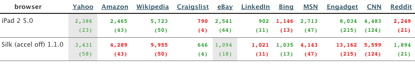
The results are mixed with iPad 2 being faster for most but not all URLs. The iPad 2 is fastest in 7 URLs. Silk is fastest in 3 URLs. One URL (eBay) is apples and oranges since Silk gets a mobile version of the site (18 resources compared to 64 resources for the desktop version).
Silk vs Galaxy
Comparing the Galaxy 7.0 to any other tablet is not fair since Galaxy 7.0 receives a lighter mobile version in 6 of 11 URLs. The Galaxy 7.0 has the slowest page load time in 3 of the 4 URLs where it, Galaxy 10.1, and Silk all receive the desktop version. Since it’s slower head-to-head and has mobile versions in the other URLs, I’ll focus on comparing Silk to the Galaxy 10.1.
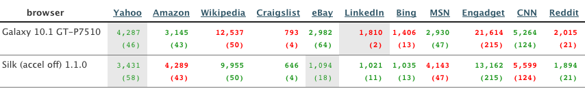
Silk has the fastest page load time in 7 URLs. The Galaxy 10.1 is faster in 3 URLs. One URL is mixed as Silk gets a mobile version (18 resources) while the Galaxy 10.1 gets a desktop version (64 resources).
 Takeaways
These results show that, as strange as it might sound, Silk appears to be faster when acceleration is turned off. Am I going to turn off acceleration on my Kindle Fire? No. I don’t want to miss out on the next wave of performance optimizations in Silk. The browser is sound. It holds its own compared to other tablet browsers. Once the acceleration gets sorted out I expect it’ll do even better.
More importantly, it’s nice to have some real data and to have Loadtimer to help with future comparisons. Doing these comparisons to see which browser/tablet/phone is fastest makes for entertaining reading and heated competition. But all of us should expect more scientific rigor in the reviews we read, and push authors and ourselves to build and use better tools for measuring performance. I hope Loadtimer is useful. Loadtimer plus pcapperf and the Mobile Perf bookmarklet are the start of a mobile performance toolkit. Between the three of them I’m able to do most of what I need for analyzing mobile performance. It’s still a little clunky, but just as it happened in the desktop world we’ll see better tools with increasingly powerful features across more platforms as the industry matures. It’s still early days.
Loadtimer: a mobile test harness
Measuring mobile performance is hard
When Amazon announced their Silk browser I got excited reading about the “split architecture”. I’m not big on ereaders but I pre-ordered my Kindle Fire that day. It arrived a week or two ago. I’ve been playing with it trying to find a scientific way to measure page load times for various websites. It’s not easy.
- Since it’s a new browser and runs on a tablet we don’t have plugins like Firebug.
- It doesn’t (yet) support the Navigation Timing spec, so even though I can inspect pages using Firebug Lite (via the Mobile Perf bookmarklet) and Weinre (I haven’t tried it but I assume it works), there’s no page load time value to extract.
- Connecting my Fire to a wifi hotspot on my laptop running tcpdump (the technique evangelized by pcapperf) doesn’t work in accelerated mode because Silk uses SPDY over SSL. This technique works when acceleration is turned off, but I want to see the performance optimizations.
While I was poking at this problem a bunch of Kindle Fire reviews came out. Most of them talked about the performance of Silk, but I was disappointed by the lack of scientific rigor in the testing. Instead of data there were subjective statements like “the iPad took about half as long [compared to Silk]” and “the Fire routinely got beat in rendering pages but often not by much”. Most of the articles did not include a description of the test procedures. I contacted one of the authors who confided that they used a stopwatch to measure page load times.
If we’re going to critique Silk and compare its performance to other browsers we need reproducible, unbiased techniques for testing performance. Using a stopwatch or loading pages side-by-side and doing a visual comparison to determine which is faster are not reliable methods for measuring performance. We need better tools.
Introducing Loadtimer
Anyone doing mobile web development knows that dev tools for mobile are lacking. Firebug came out in 2006. We’re getting close to having that kind of functionality in mobile browsers using remote debuggers, but it’s pretty safe to say the state of mobile dev tools is 3-5 years behind desktop tools. It might not be sexy, but there’s a lot to be gained from taking tools and techniques that worked on the desktop and moving them to mobile.
In that vein I’ve been working the last few days to build an iframe-based test harness similar to one I built back in 2003. I call it Loadtimer. (I was shocked to see this domain was available – that’s a first.) Here’s a screenshot:

The way it works is straightforward:
- It’s preloaded with a list of popular URLs. The list of URLs can be modified.
- The URLs are loaded one-at-a-time into the iframe lower in the page.
- The iframe’s onload time is measured and displayed on the right next to each URL.
- If you check “record load times” the page load time is beaconed to the specified URL. The beacon URL defaults to point to loadtimer.org, but you can modify it if, for example, you’re testing some private pages and want the results to go to your own server.
- You can’t test websites that have “framebusting” code that prevents them from being loaded in an iframe, such as Google, YouTube, Twitter, and NYTimes.
There are some subtle optimizations worth noting:
- You should clear the cache between each run (unless you explicitly want to test the primed cache experience). There’s no way for the test harness to clear the cache, but it does have a check that helps remind you to clear the cache. (It loads a script that is known to take 3 seconds to load – if it takes less than 3 seconds it means the cache wasn’t cleared.)
- It’s possible that URL 1’s unload time could make URL 2’s onload time be longer than it actually should be. To avoid this
about:blankis loaded between each URL. - The order of the preset URLs is randomized to mitigate biases across URLs, for example, where URL 1 loads resources used by URL 2.
Two biases that aren’t addressed by Loadtimer:
- DNS resolutions aren’t cleared. I don’t think there’s a way to do this on mobile devices short of power cycling. This could be a significant issue when comparing Silk with acceleration on and off. When acceleration is on there’s only one DNS lookup, whereas when acceleration is off there’s a DNS lookup for each hostname in the page (13 domains per page on average). Having the DNS resolutions cached gives an advantage to acceleration being off.
- Favicons aren’t loaded for websites in iframes. This probably has a negligible impact on page load times.
 Have at it
The nice thing about the Loadtimer test harness is that it’s web-based – nothing to install. This ensures it’ll work on all mobile phones and tablets that support JavaScript. The code is open source. There’s a forum for questions and discussions.
There’s also a results page. If you select the “record load times” checkbox you’ll be helping out by contributing to the crowdsourced data that’s being gathered. Getting back to what started all of this, I’ve also been using Loadtimer the last few days to compare the performance of Silk to other tablets. Those results are the topic of my next blog post – see you there.
Add your site & custom fonts
The Nov 15 2011 crawls for the HTTP Archive and HTTP Archive Mobile are done. Two new things were added.
Add your site
Our goal is to crawl the world’s top 1,000,000 URLs. This month we doubled the number of URLs from 17K to 35K. We’re still a ways away but making progress. But what if you’d like your website to be in the HTTP Archive but it isn’t in the top 1M?
Now you can add your site to the HTTP Archive. If it’s already in the list we’ll tell you and point you to any data that’s been gathered so far. If it’s not in the list we’ll queue it up for the next crawl. We moderate all additions to make sure the URL is valid. We also have a limit of 1 URL per website. We strive to crawl a site’s main URL (e.g., https://stevesouders.com/) but not all the subpages within a site (https://stevesouders.com/about.php, http://www.example.com/videos.php, etc.).
Custom Fonts
I’ve been thinking more about custom fonts after Typekit‘s acquisition by Adobe and seeing Jeff Veen at Velocity Europe. (Make sure to watch the video of Jeff’s talk – it’s an amazing presentation with a humorous start.) So this week I added a chart to track the adoption of custom fonts:

Typekit is clearly on to something – the use of custom fonts has tripled in one year. I warn against using @font-face for performance reasons, but performance isn’t all that matters. (Gasp!) Custom fonts obviously have aesthetic benefits that are attractive to website owners.
Fortunately, Typekit has several performance optimizations in how they load fonts. They combine all the fonts in a single stylesheet for browsers that support data: URIs. The fonts are served over a CDN. The font’s are only cacheable for 5 minutes which hurts repeat visits, but I believe they’re working on longer cache times.
For truly fast and robust font loading we need to lean on browser developers to implement better caching for fonts and better timeout choices during rendering. I’ll be talking about this during my High Performance HTML5 session at QCon on Friday.
HTTP Archive growing
Today the number of URLs analyzed was doubled in both the HTTP Archive (from 17K to 34K URLs) and in the HTTP Archive Mobile (from 1K to 2K URLs).


This is a small step toward our goal of 1 million URLs, but it validates numerous code changes that landed recently:
- 22: update URL lists – Previously the list of URLs to crawl was manually created (by me) from multiple other lists (Alexa, Quantcast, Fortune 500, etc.). Because it was manually created it wasn’t updated frequently. Now the list is based on the Alexa Top 1,000,000 Sites and is updated every crawl.
- 243: handle non-ranked URLs – Some of the URLs crawled up until now are NOT in the Alexa Top 1M. In order to support looking at long term trends (by selecting “intersection“) I wanted to continue crawling these outliers. So the list of URLs that is crawled supports crawling non-ranked websites. This will allow many other nice features that you’ll hear about next week.
- 242: rewrite batch_process.php – There’s a bunch of code for doing the crawl that needed to be made more efficient as we increase two orders of magnitude.
- 68: cache aggregate stats for trends.php – Again, in order to deal with a larger number of URLs and still generate charts quickly, I introduced a caching layer for the aggregate stats.
- #196: Publish a mysql schema dump – Exploring the data is now easier. Instead of having to setup an entire instance of the code, you simply create the tables based on the schema dump and download data that is of interest.
With these and other changes behind us, we’ll continue to increase the number of URLs to reach our goal. There are still some big tasks to tackle including changing the DB schema, increasing the capacity on mobile with more devices or switching to an emulator, and combining these two sites into a single site for easier comparison of desktop & mobile data.
No blog post about HTTP Archive would be complete without some observations. As mentioned earlier, whenever looking at long term trends I choose the intersection – which means the exact same URLs are included in every data point.
The main trend I’ve been noticing is how the size of resources is growing much faster than the number of resources. This growth is most evident in scripts and images. It’s no surprise – the Web is getting bigger. But now we can see where that’s happening and explore solutions.


I also wanted to shout out to Pat Meenan and Guy (“Guypo”) Podjarny. Pat works at Google and is the creator of WebPagetest, which is the foundation for the HTTP Archive (Mobile). Guypo works at Blaze and provides additional infrastructure and devices for all the mobile testing. In addition, there are a growing number of contributors to the open source project. And none of this would be happening without support from our sponsors: Google, Mozilla, New Relic, O’Reilly Media, Etsy, Strangeloop, and dynaTrace Software.
Watch for a fun announcement next week.
Velocity Europe – High Performance Berlin!
Velocity Europe is less than two weeks away. It’s happening November 8-9 in Berlin at the Hotel Maritim ProArte. I’ve heard good things about the venue and am excited to get there and check it out.
This event has been a long time coming. A handful of web performance and operations savants (including members of the Program Committee) have been encouraging us for years to bring Velocity to Europe, and now it’s actually happening. And (drum roll please) the price is only EUR 600 (excl. VAT) if you use the 20% discount code veu11sts. (And don’t forget about the free Velocity Online Conference this week – see more below.)
The Velocity Europe speaker line-up is exceptional. Some highlights include:
- Jon Jenkins from Amazon.com is talking about their approach to the challenges of mobile browsing. Jon is the Director of Software Development for Amazon Silk. I’m looking forward to more details about Silk’s split architecture.
- Tim Morrow delivers the background for Betfair’s promise to deliver a fast experience to their customers, and their progress on that promise.
- Theo Schlossnagle is a recognized leader at Velocity. He’s giving two talks on web operations careers and monitoring.
- Estelle Weyl joins Velocity for the first time talking about the nuances of mobile rendering performance. I learn something new everytime I hear Estelle speak, so am excited to welcome her to Velocity.
- Ivo Teel discusses the balance we all face between features and performance and how they’re handling that at Spil Games.
- Jeff Veen knows the importance of 3rd party performance and availability as the CEO of Typekit. Jeff’s an amazing, engaging speaker. Reading his session description gave me goosebumps with anticipation: Jeff sat on a couch in the Typekit offices, staring out the window, and wondering if everything their company had been working towards was about to slip through their fingers…
There’s much much more – lightning demos, browser vendor talks, Allspaw on anticipating failure, Mandelin on JavaScript performance – I’ve got to stop here but please check out the entire schedule.
I want to give a shout out to the Velocity Europe Program Committee: Patrick Debois, Aaron Peters, Schlomo Schapiro, Jeroen Tjepkema, and Sean Treadway. They’ve participated in numerous video concalls (yay Google Hangouts!) to review proposals, build the program, and shape Velocity to be a European conference. And they might have one more card up their sleeve – more on that later.
You can get a free warm-up for Velocity Europe at the Velocity Online Conference this week. It’s Wednesday October 26 9-11:30am PDT. John Allspaw, Velocity co-chair, has rounded up four speakers to cover several hot topics including monitoring, global DNS, and making yourself even more awesome(!). It’s free, but you have to register for Velocity OLC if you want to get in on the conversation.
If you’re heading to Berlin you should also check out CounchConf Berlin on Nov 7. NoSQL has great performance benefits and Couchbase is a good choice for many mobile apps. Use couchconf_discount for 10% off registration.
The last time I was in Berlin was for JSConf.eu 2009. The city had a high tech vibe and the crowd was extremely knowledgeable and enthusiastic. I’m excited to get back to Berlin for Velocity Europe and do the web performance and operations deep dives that are the core of Velocity. If you want to have a website that’s always fast and always up, Velocity Europe is the place to be. I hope to see you there.
HTTP Archive: new code, new charts
The HTTP Archive is a permanent record of web performance information started in October 2010. The world’s top 17,000 web pages are analyzed twice each month to collect information such as the number and size of HTTP requests, whether responses are cacheable, the percent of pages with errors, and the average Page Speed score. The code is open source and all the data is downloadable.
The next big step is to increase the number of URLs to 1 million. The biggest task to get to this point is improving the database schema and caching. This past week I made some significant code contributions around caching aggregate stats across all the web sites. Even with only 17K URLs the speed improvement for generating charts is noticeable.
The new stats cache allows me to aggregate more data than before, so I was able to add several trending charts. (The increases/decreases are Nov 15 2010 to Oct 15 2011.)
- percent of sites using Google Libraries API – up 6%
- percent of sites using Flash – down 2%
- percent of responses with caching headers – up 4%
- percent of requests made using HTTPS – up 1%
- percent of pages with one or more errors – down 2%
- percent of pages with one or more redirects – up 7%
Most of the news is good from a performance perspective, except for the increase in redirects. Here’s the caching headers chart as an example:

I dropped the following charts:
- popular JavaScript libraries – I created this chart using handcrafted regular expressions that attempted to find requests for popular frameworks such as jQuery and YUI. Those regexes are not always accurate and are hard to maintain. I recommend people use the JavaScript Usage Statistics from BuiltWith for this information.
- popular web servers – Again, BuiltWith’s Web Server Usage Statistics is a better reference for this information.
- sites with the most (JavaScript | CSS | Images | Flash) – These charts were interesting, but not that useful.
- popular scripts – This was a list of the top 5 most referenced scripts based on a specific URL. The problem is that the same script can have a URL that varies based on hostnames, querystring parameters, etc.
The new stats cache is a great step forward. I have a few more big coding sessions to finish but I hope to get enough done that we can start increasing the number of URLs in the next run or two. I’ll keep you posted.
frontend SPOF survey
Pat Meenan had a great blog post yesterday, Testing for Frontend SPOF. “SPOF” means single point of failure. I coined the term frontend SPOF to describe the all-too-likely situation where the HTML document returns successfully, but some other resource (a stylesheet, script, or font file) blocks the entire website from loading. This typically manifests itself as a blank white screen that the user stares out for 20 seconds or longer.
Frontend SPOF happens most frequently with third party content. If the HTML document returns successfully, then all the resources from the main website are likely to return successfully, as well. Third party content, however, isn’t controlled by the main website and thus could be suffering an outage or overload while the main website is working fine. As a result, the uptime of a website is no greater than the availability of the third party resources it uses that are in a position to cause frontend SPOF.
In my blog post of the same name I describe how Frontend SPOF happens and ways to avoid it, but I don’t provide a way for website owners to determine which third party resources may cause frontend SPOF. This is where Pat comes in. He’s created a public blackhole server: blackhole.webpagetest.org with the static IP address 72.66.115.13. Pointing your third party resources to this blackhole and reloading the page tells you if those resources cause frontend SPOF. Since Pat is the creator of WebPagetest.org, he has integrated this into the scripting capabilities of that tool so website owners can load their website and determine if any third party resources cause frontend SPOF.
/etc/hosts
I took a different approach outlined by Pat: I added the following lines to my /etc/hosts file (your location may vary) mapping these third party hostnames to point to the blackhole server:
72.66.115.13 apis.google.com
72.66.115.13 www.google-analytics.com
72.66.115.13 connect.facebook.net
72.66.115.13 platform.twitter.com
72.66.115.13 s7.addthis.com
72.66.115.13 l.addthiscdn.com
72.66.115.13 cf.addthis.com
72.66.115.13 api-public.addthis.com
72.66.115.13 widget.quantcast.com
72.66.115.13 ak.quantcast.com
72.66.115.13 assets.omniture.com
72.66.115.13 www.omniture.com
72.66.115.13 scripts.omniture.com
72.66.115.13 b.voicefive.com
72.66.115.13 ar.voicefive.com
72.66.115.13 c.statcounter.com
72.66.115.13 www.statcounter.com
72.66.115.13 www-beta.statcounter.com
72.66.115.13 js.revsci.net
After restarting my browser all requests to these hostnames will timeout. Pat’s blog post mentions 20 seconds for a timeout. He was running on Windows. I’m running on my Macbook where the timeout is 75 seconds! Any website that references third party content on these hostnames in a way that produces frontend SPOF will be blank for 75 seconds – an easy failure to spot.
survey says
THE GOOD: At this point I started loading the top 100 US websites. I was pleasantly surprised. None of the top 20 websites suffered from frontend SPOF. There were several that loaded third party content from these hostnames, but they had safeguarded themselves:
- MSN makes a request to
ar.voicefive.com, but does it asynchronously using a document.write technique. - AOL references
platform.twitter.com, but puts the SCRIPT tag at the very bottom of the BODY so page rendering isn’t blocked. - IMDB uses the async version of Google Analytics, and puts the
platform.twitter.comwidget in an iframe. - LiveJournal goes above and beyond by wrapping the Google +1 and Facebook widgets in a homegrown async script loader.
THE BAD: Going through the top 100 I found five websites that had frontend SPOF:
- CNET loads
http://platform.twitter.com/widgets.jsin the HEAD as a blocking script. - StumbleUpon loads
http://connect.facebook.net/en_US/all.jsat the top of BODY as a blocking script. - NFL loads
http://connect.facebook.net/en_US/all.jsin the HEAD as a blocking script. - Hulu, incredibly, loads Google Analytics in the HEAD as a blocking script. Please use the async snippet!
- Expedia loads
http://connect.facebook.net/en_US/all.jsas a blocking script in the middle of the page, so the right half of the page is blocked from rendering.
These results, although better than I expected, are still alarming. Although I only found five websites with frontend SPOF, that’s 5% of the overall sample. The percentage will likely grow as the sample size grows because best practices are more widely adopted by the top sites. Also, my list of third party hostnames is a small subset of all widgets and analytics available on the Web. And remember, I didn’t even look at ads.
Is it really worth blocking your site’s entire page for a widget button or analytics beacon – especially when workarounds exist? If you’re one of the five sites that faltered above, do yourself and your users a favor and find a way to avoid frontend SPOF. And if you’re outside the top 100, test your site using Pat’s blackhole server by editing /etc/hosts or following Pat’s instructions for testing frontend SPOF on WebPagetest.org.
Improving app cache
I recently found out about the W3C Workshop on The Future of Off-line Web Applications on November 5 in Redwood City. I won’t be able to attend (I’ll be heading to Velocity Europe), but I feel like app cache needs improving so I summarized my thoughts and sent it to the workshop organizers. I also pinged some mobile gurus and got their thoughts on app cache.
My Thoughts
SUMMARY: App cache is complicated and frequently produces an unexpected user experience. It’s also being (ab)used as a workaround for the fact that the browser’s cache does not cache in an effective way – this is just an arms race for finite resources.
DETAILS: I’ve spoken at many mobile-specific conferences and meetups in the last few months. When I explain the way app cache actually works, developers come up afterward and say “now I finally understand what was happening with my offline app.” These are the leading mobile developers in the world.
John Allsopp does a great job of outlining the gotchas, and I’ve added some (slides 50&51):
- HTML responses with the MANIFEST attribute are stored in app cache by default, even if they’re not in the CACHE: section of the manifest file.
- If a CACHE: resource 404s then none of the resources are cached.
- The manifest file must be changed in order for changed CACHE: resources to be updated.
- Modified CACHE: resources aren’t seen by the user until the second time they load the app – even if they’re online.
It’s easy to point out problems – you folks have the more difficult job of finding solutions. But I’ll make a few suggestions:
- Use updated resources on first load – The developer needs a way to say “if the user is online, then fetch (some/all) of the CACHE: resources that have changed before rendering the app”. I would vote to make this the default behavior, and provide a way to toggle it (in the manifest file or HTML attribute). Perhaps this should also be done at the individual resource level – “I want updated scripts to block the initial rendering, but nothing else”. The manifest file could have an indicator of which resources to check & download before doing the initial rendering.
- 404s – I haven’t tested this myself, but it seems like overkill. Every response in the CACHE: section should be cached, independent of the other responses. Perhaps this is browser-specific?
- updateReady flag – It’s great that developers can use the updateReady event to prompt the user to reload the app if any CACHE: resources have changed underneath them, but the bar is too high. In addition, have a flag that indicates that the browser should prompt the user automatically if any CACHE: resources were updated.
Finally, on the topic of arms race, I know many websites that are using app cache as a way to store images, scripts, and stylesheets. Why? It’s because the browser’s disk cache is poorly implemented. App cache provides a dedicated amount of space for a specific website (as opposed to a common shared space). App cache allows for prioritization – if I have 10M of resources I can put the scripts in the CACHE: section so they don’t get purged at the expense of less painful images.
Certainly a better solution would be for the browsers to have improved the behavior of disk cache 5 years ago. But given where we are, an increasing number of websites are consuming the user’s disk space. In most cases the user doesn’t have a way or doesn’t know how to clear app cache. Better user control over app cache is needed. I suggest that clearing “data” clears both the disk cache as well as app cache. Alternatively, we extend the browser UI to have an obvious “clear app cache” entry. Currently in Firefox and Chrome you can only clear app cache on a site-by-site basis, and the UI isn’t obvious. In Firefox it’s under Tools | Options | Advanced | Network | Remove. In Chrome it’s under chrome://appcache-internals/.
The most important near term fix is better patterns and examples.
- My first offline app had a login form on the index.html – how should I handle that?
- What if the JSON data in app cache requires authentication and the user is offline – use it or not?
- I’ve never seen an example that uses the FALLBACK: section.
Adoption of current app cache would go much more smoothly with patterns and examples that address these gaps, and perhaps a JS helper lib to wrap updateReady and other standard dev tasks.
Mobile Gurus
A great email thread resulted when I asked a bunch of mobile gurus for their thoughts about app cache. Here’s a summary of the comments that resulted:
| Scott Jehl | Agreed on app cache’s clumsiness. It’s so close though! The cache clearing is terrible for both users and developers. |
| Nicholas Zakas | +1 for AppCache clumsiness. My big complaint is requiring a special MIME type for the manifest file. This effectively limits its use to people who have access to their server configuration. |
| Yehuda Katz | My biggest concern is the lack of a feature that would make it possible to load the main index.html from cache, but only if the user agent is offline.Currently, if the user agent is online, the entire cache manifest, including the main index.html, is used. As a result, developers are required to come up with some non-standard UI to let the application user know that they should refresh the page in order to get more updated information.This is definitely the way to get the most performance, even when the user agent is online, but it creates an extremely clumsy workflow which significantly impedes adoption. I have given a number of talks on the cache manifest, and this caveat is the one that change the audience reaction from nodding heads to “oh no, another thing I have to spend time working out how to rebuild my application in order to use”.
Again, I understand the rationale for the design, but I think a way to say “if the user agent is online, block until the cache manifest is downloaded” would significantly improve adoption and widen the appropriate use-cases for the technology. |
| Scott Jehl | I agree – the necessary refresh is the biggest downfall for me, too. It’s really prohibitive for using appcache in progressive enhancement approaches (where there’s actually HTML content in the page that may update regularly).It’d be great if you could set up appcache to kick-in when the user is actually offline, but otherwise stay out of the way and let the browser defer to normal requests and caching. |
| Yehuda Katz | I actually think we can get away with a more aggressive approach. When the device is online, first request the application manifest. If the manifest is identical, continue using the app cache. This means a short blocking request for the app manifest, but the (good) atomic cache behavior. If the manifest is not identical, fall back to normal HTTP caching semantics.
It needs to be a single flag in the manifest I think. |
| Dion Almaer | Totally agree. In a recent mobile project we ended up writing our own caching system that had us use HTTP caching… It was very much a pain to have to do this work. |
I like Yehuda’s suggestion about a blocking manifest check when the user is online controlled by a flag in the manifest file. We need more thinking around how to improve app cache. Please checkout the W3C Workshop on The Future of Off-line Web Applications website and send them your thoughts.
UA switching: be careful
At least once a day I’m in a conversation, email thread, or twitter exchange about monitoring websites. Lately this has focused on mobile. Tools like WebPagetest make it easier to monitor websites from the perspective of a desktop browser, but doing this from the perspective of a mobile device is still a significant challenge.
This issue is a current topic of discussion around HTTP Archive Mobile. Blaze.io supports the project through its Mobitest framework: every two weeks I submit 1000 URLs to their framework which downloads each URL 3 times on a real iPhone. I love that the resultant waterfall chart and screenshots are gathered from a real phone. But our next step is to scale this up to 100K and then 1M URLs. It’s going to be hard to scale up to this using real phones due to cost and maintenance issues.
Another alternative is to use an emulator. The timings won’t be identical to the actual mobile device, but HTTP Archive Mobile is more focused on HTTP headers, size and number of responses, etc. These structural aspects of the page should be identical between the actual phone and its emulator. We’ll soon do side-by-side tests to confirm this.
But this post is about a third alternative: UA switching. Changing the User-Agent string of a desktop browser to mimic a mobile browser and using that to gather the data could be accomplished this afternoon. The issue is that the results might differ from what is seen on an actual phone. Websites that don’t do anything special for mobile would probably be similar enough. And websites that look at the UA string on the serverside to determine how to alter the page would also be okay. But websites that adapt the page based on browser feature detection on the clientside, e.g. responsive web design, would differ dramatically.
When asked for an example of such a site I recalled seeing Scott Jehl at Breaking Development Conference talking about the recent launch of Boston Globe using responsive web design. It’s an amazing feat of engineering. Its adaptability from a single code base across so many devices is beautiful to watch in this promo video.
Because the Boston Globe uses responsive web design, the UI varies depending on the browser – not the UA string. Here’s a screenshot from my iPhone. The content has been modified to fit on the iPhone’s smaller screen.

Figure 1. iPhone browser
Figure 2 shows the Boston Globe as rendered inside Chrome on my laptop. Since the screen is much bigger the content is laid out quite differently compared to the iPhone. We see three columns instead of one, a wider horizontal navigation bar, etc.

Figure 2. Chrome
Figure 3 is also from Chrome, but in this case I changed the User-Agent string to mimic an iPhone:
Mozilla/5.0 (iPhone; U; CPU iPhone OS 4_3_1 like Mac OS X; en-us) AppleWebKit/533.17.9 (KHTML, like Gecko) Version/5.0.2 Mobile/8J2 Safari/6533.18.5Even though the UA string says “iPhone”, the page is laid out exactly as it is for normal Chrome. (I confirmed the UA string by inspecting HTTP headers.)

Figure 3. Chrome with iPhone User-Agent string
Responsive web design is fairly new. There are still a number of websites that modify the HTML layout based on serverside UA detection. In fact, while generating the screenshot for Figure 3 I tried several other websites and most of them returned a layout customized for iPhone.
If you’re working on a framework to monitor mobile websites, be careful about taking the UA switching approach. If the websites you’re monitoring do serverside UA detection, you’ll probably be okay. But if the web app is based on clientside feature detection, the results you receive from UA switching won’t match what is seen on real mobile devices. As the adoption of responsive web design increases so will the number of websites that fall into this gap of mismeasurement. Real devices or emulators are a safer bet.
App cache & localStorage survey
In preparation for my talk at HTML5 Dev Conf I surveyed the Alexa US Top 10 websites to see which ones use app cache and localStorage. I mostly focus on mobile these days so it’s natural to think I ran these tests from a mobile browser, which I did. But I also tested with a desktop browser.
Some people might ask, Why a desktop browser?
To which I would reply, Why not a desktop browser?
I blogged previously about how Google and Bing use localStorage on mobile devices. It’s a powerful performance technique. They break up their JavaScript and CSS into smaller blocks and save them in localStorage. Simultaneously they set a cookie so that the server knows not to send that payload on subsequent searches, a savings of 150-170 kB before gzipping.
In the comments on that post Simon asked:
I’m curious why the techniques with LocalStorage are used for the mobile versions of the search sites but not for the standard desktop versions – I would think that this technique would work well [on] all clients, no?
I agree – this and other HTML5 web storage techniques make sense for the desktop, too. There are some reasons why we’re seeing these used first on mobile:
- Mobile latencies are higher and connection speeds are lower, so clientside caching is more important on mobile.
- Mobile disk cache sizes are smaller than desktop sizes, so a better alternative is needed for mobile.
- There are still desktop browsers with significant market share that are missing many HTML5 capabilities, whereas mobile browsers have more support for HTML5.
Even though the motivation for app cache and localStorage are stronger for mobile, they should also be used when the website is accessed from a desktop browser. I did a quick survey to see which of the top 10 websites were using app cache or localStorage on either mobile or desktop. Here are the results:
| Website | Mobile | Desktop | ||
|---|---|---|---|---|
| app cache | localStorage | app cache | localStorage | |
| Google Search | no | yes | no | yes [1] |
| Bing | no | yes | no | no |
| no | yes | no | no | |
| Yahoo! Front Page | no | yes [2] | no | no |
| YouTube | no | yes | no | no |
| Amazon | no | no | no | yes [3] |
| yes | yes | no | yes | |
| no | no | no | no | |
| eBay | no | no | no | no |
| MSN.com | no | no | no | no |
[2] Yahoo! Front Page only stores two numbers.
[3] Amazon on the desktop only stores a ~30 character string.
Ignoring the small uses of localStorage, 5 of these top 10 websites use localStorage on mobile, but only 2 out of 10 use localStorage (or sessionStorage) on desktop. None of them use app cache, either on mobile or desktop except for Twitter on mobile. I’m surprised no one is using app cache. It’s not appropriate for all applications, such as search, but I would enjoy catching up on Twitter, Facebook, and LinkedIn on the plane – potentially from my laptop in addition to my mobile device. App cache not only brings this offline capability, but provides better caching than the browser’s disk cache.
I’ll repeat this survey in a few months to track the progress. I expect we’ll see the use of localStorage and app cache increase, and for desktop to catch up to mobile.